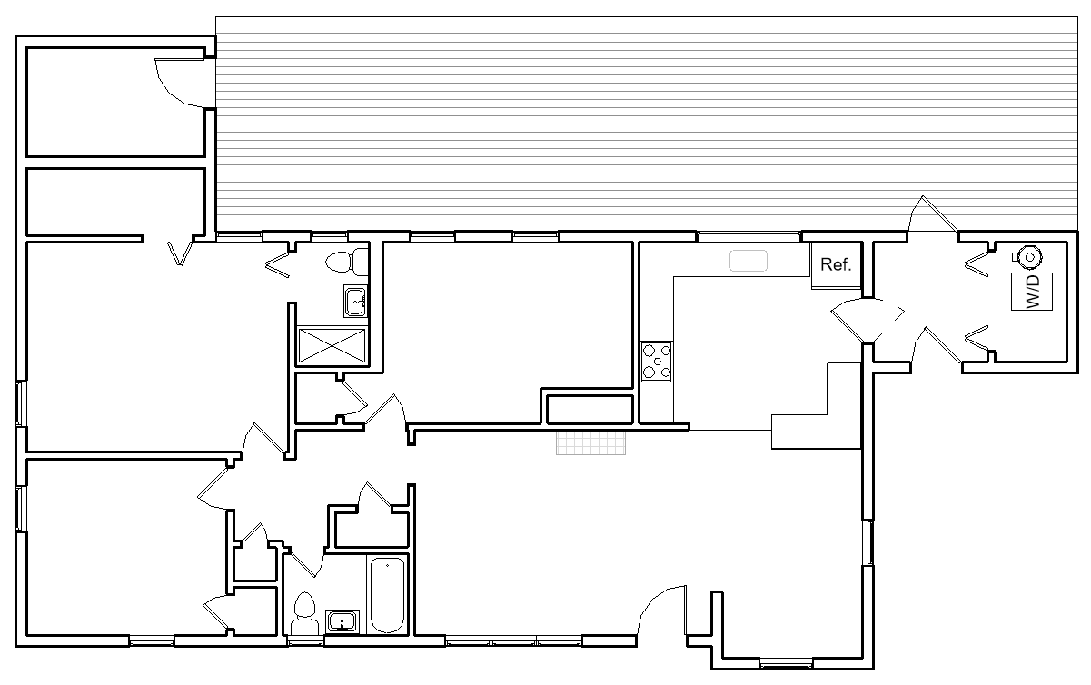
Our House, As it Exists Right Now
The week the world began to end, we closed on our first house. As we pried off baseboards and painted our bedroom, NASA told employees not to come back to the office. We caulked trim and listened, teary-eyed, to a podcast about American companies shifting to ventilator production. One late night as we scrubbed paint from our fingers, Twitter told me that Tom Hanks had Coronavirus.
Back then, every trip to Home Depot felt like a game of Russian roulette. One week, I was there ten times. Between late nights of painting and caulking and cleaning and patching our new-old house, we did our day jobs from the dining table in our one-bedroom apartment. Joey’s birthday passed; I gave him a card with a plan for a joint May birthday celebration and said he could share with me this year. (Remember when we thought it could be over before summer?) We moved with the help of two friends; we bought them Chick Fil A and ate on opposite sides of our deck, squinting in the sun. We didn’t know yet that we were more likely to get sick from a cough than a touch; Joey wiped down the U-Haul with Clorox wipes and hoped for the best.
None of this was ideal.
And yet. No social life, no in-person church, no international travel, but a house that was ours. Jobs that we kept. Bodies that stayed healthy. A home that we slowly worked on, checking things off our list one weekend at a time.
I shared our frustrations, triumphs, and process on Instagram stories. Several people reached out to say that it was their favorite quarantine saga: Alyssa and Joey Do Things, Often Badly. In disappearing posts, I gave house tours, swatched paint samples, and complained about the surprises we found (such as the previous owner’s laundry, left in the washer for weeks). March was a challenge wrapped in a pandemic, and sharing was cathartic.
But once we moved in, I slowed down on the sharing. When you’re a designer, there is an expectation that your house will be a beautiful showcase of your taste and skill. I quickly ran up against my own insecurities. I suddenly understood why there are so many before-and-after posts and not a lot of before-and-during posts: the middle part sucks. It especially sucks when part of the process is waiting to make more money so you can move on to the next project. It really super duper sucks when you’re comparing your just-started house to the finished house tours of famous (and wealthy) residential designers and design influencers who have just completed their own beautiful homes and are revealing them as you work (1, 2, 3).
And here I am: arranging my free, inherited, and Ikea pieces; planning for the future while trying to be content with the present. So at this point, I think I need to share a little time capsule. Here is our house, as it exists right now. Not staged or perfect or even very well photographed. It’s the real-real.
I’m going to give a tour of everything, note what we’ve changed and what we plan to change. Buckle up, this is a lot!
Welcome to our home: 3 bedrooms, 2 bathrooms, and about 1400 square feet - plus a guest house! We wanted a house that was old but not ancient and one that needed some work but not a gut job. We wanted mature trees and to be close to the city, and we wanted the possibility of cut flower and vegetable gardens. We got it all, though we also spent more than we’d hoped to.
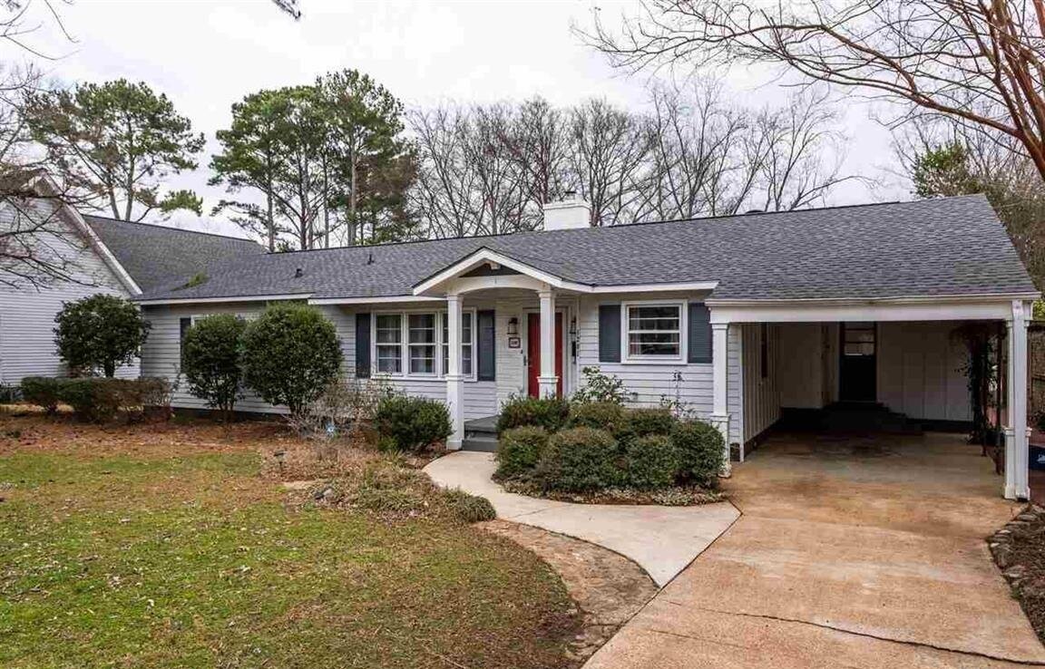


The Front Yard
We haven’t done much to the exterior and the front yard, because we figure curb appeal is currently the least of our worries. We will start working on some long-term landscaping plans in 2021, which will mean digging up all those bushes. As you can see, Joey started the task; but we abandoned it once we realized how much work it would take to remove them and moved our focus to the backyard. Mostly we’re just keeping it tidy until we finalize our plans. (Why yes, I do have a Pinterest board of inspiration that I have no idea how to implement.)
One day in the future, I’d like to look at a face lift for the front: new siding, a new front door, maybe brick steps, and possibly turning the carport into a garage. But frankly, we’re years away from most of that. The entire house has its original windows, which will be replaced in 2021. Not a very exciting upgrade, but we’ve decided we don’t want to deal with the drafts and the rattles for much longer.
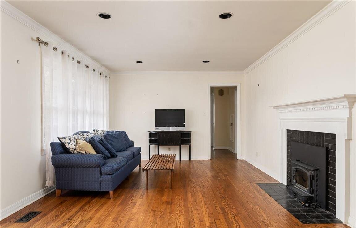
Entry/Living
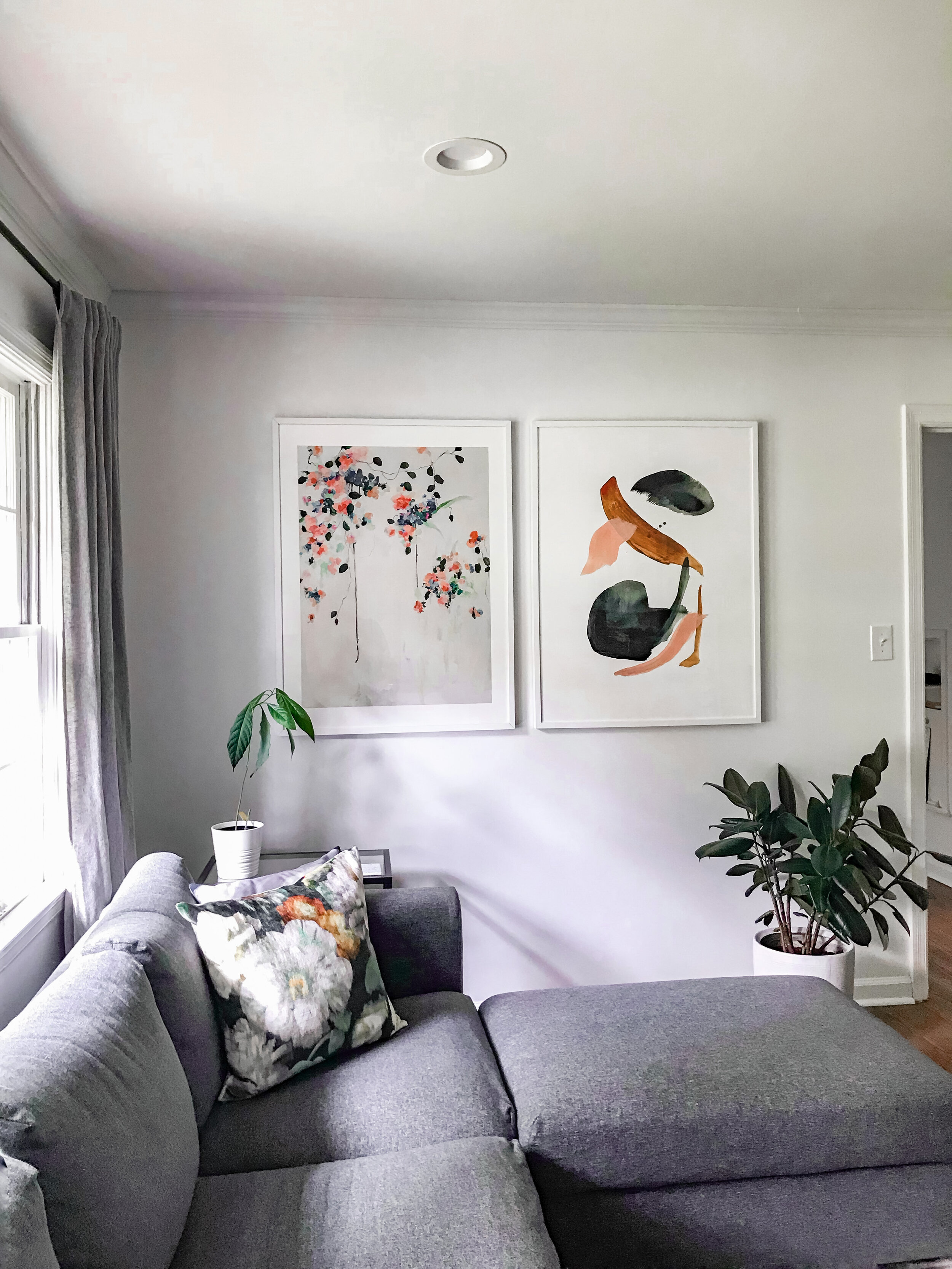
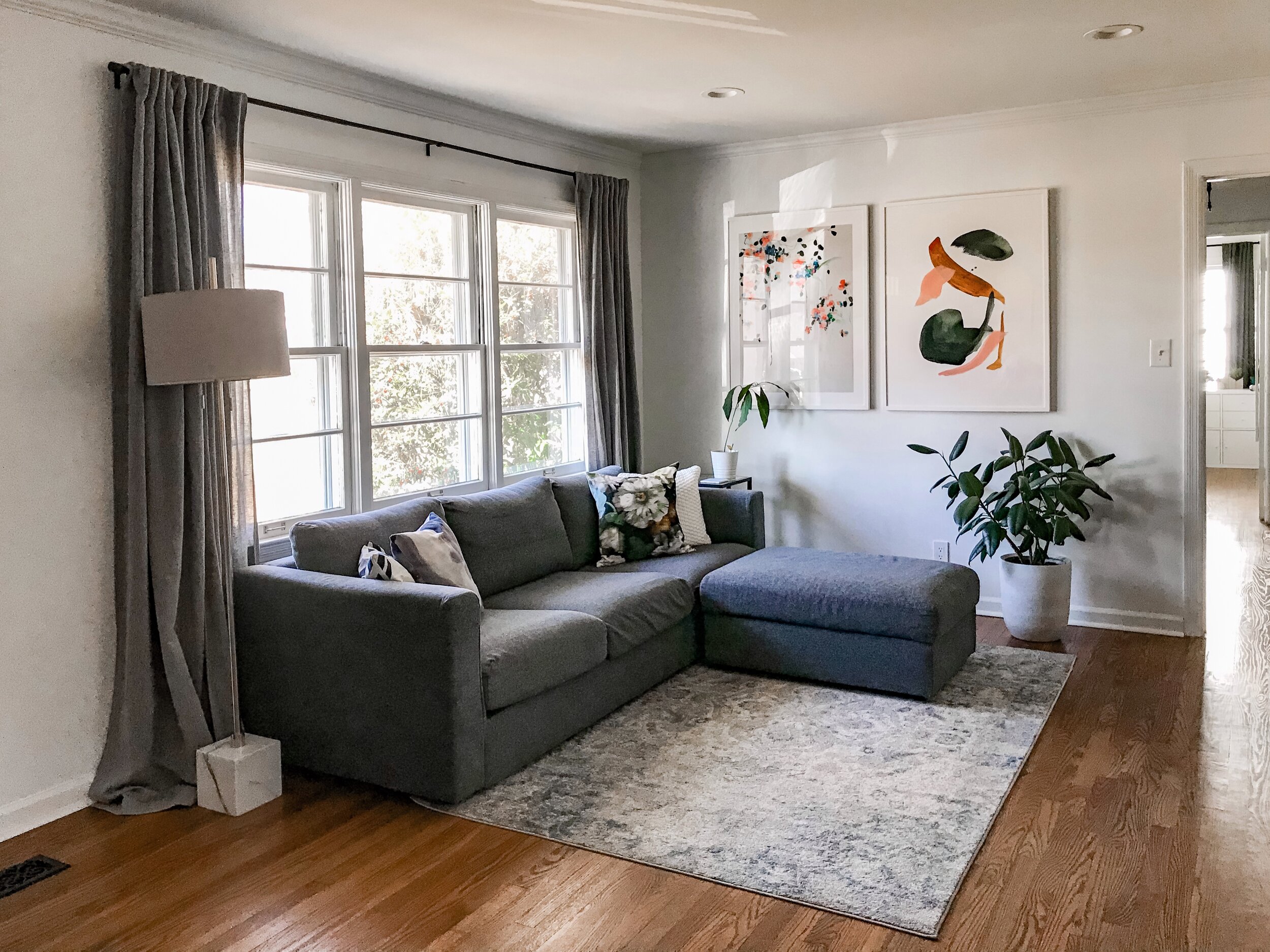
This is the area of the house I most wanted to be okay with. Long-term, I have plans to level it up, but I want the basics to be good so we can build from there. It’s hard to see in the original photos, but the walls in this room had 70 years of bad patch jobs, and I thought the crown (not original) was a touch too big for our ceiling height. Throughout the house, the trim all looked horrible. Decades of bad paint jobs, pets, and vacuum cleaners left them damaged beyond all hope.
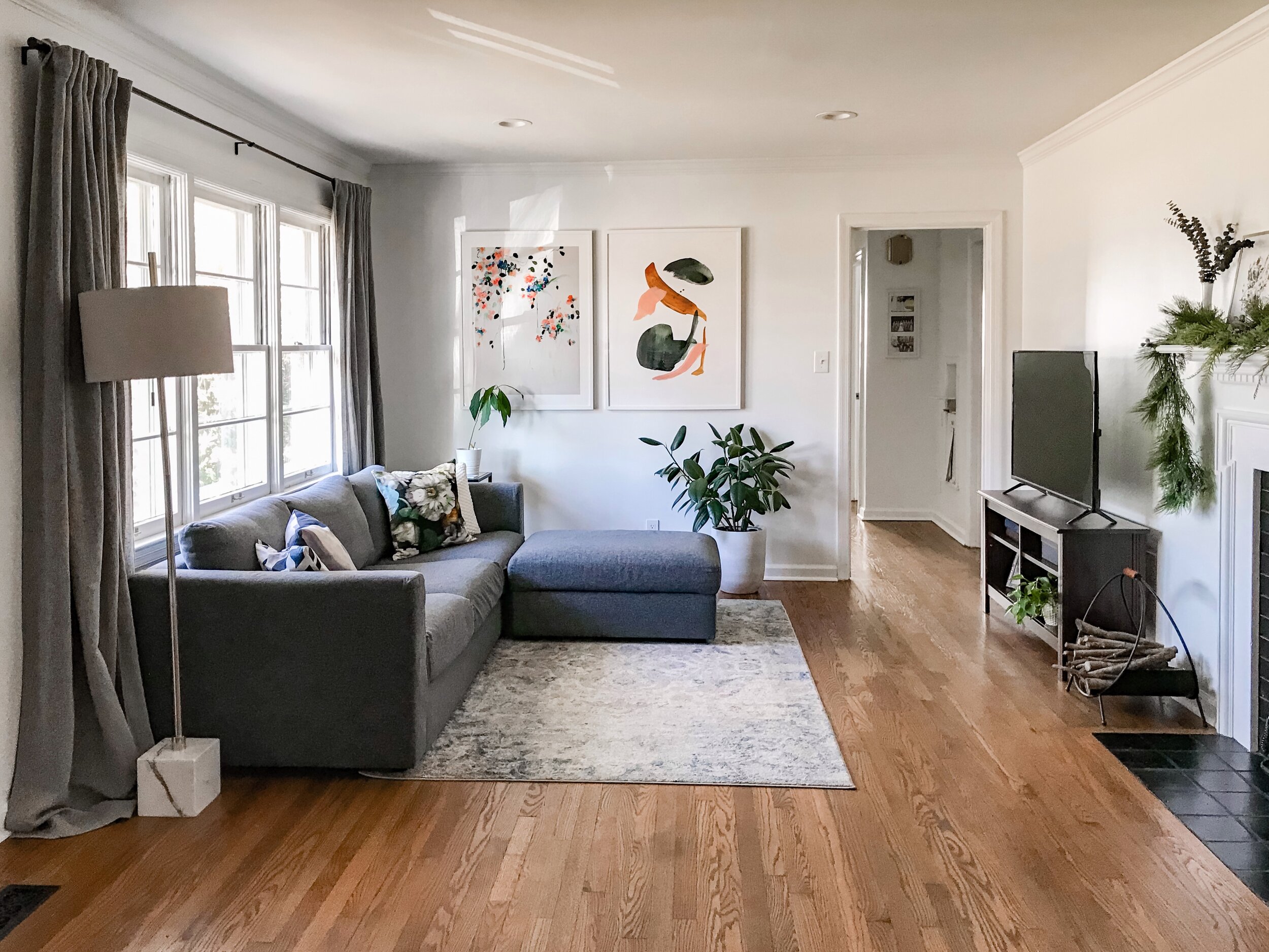
The changes: We had a contractor come in and skim coat most of the walls. We replaced all the crown and base through the whole house. So what looks like not much change in photos feels (at least to us) like a fresh start. It wasn’t cheap, but we think the building blocks matter. The whole room got painted Sherwin Williams Pure White (ceiling, trim, and walls). I swapped out the can lights throughout the entire house. The black reflectors make the ceilings look like Swiss cheese, and I wanted the lights to be as minimal as possible. It was an easy update that felt like a big deal. Joey swapped out the yellowing and mismatched outlets throughout the house for new ones, and as a final upgrade, I had him install a dimmer switch. Boom. Mood lighting.
The most exciting, room-making addition was the art. I love large art, and these pieces from Minted are now two of my favorite things that we own. I agonized a shockingly long time about them (they were expensive!), but I couldn’t love them more.
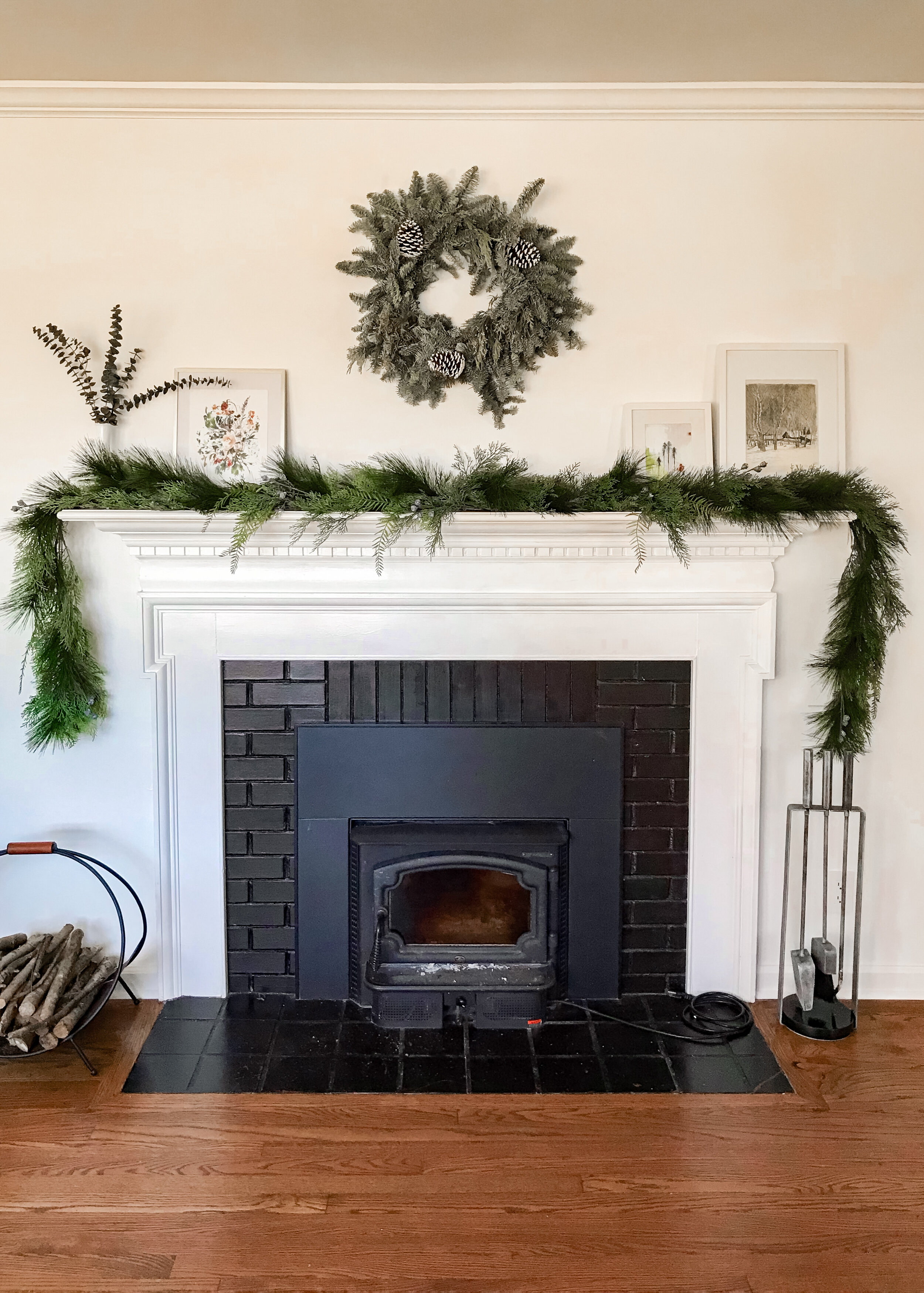
The future of this rooms: a fireplace makeover (that’s a ways down the road), and another subtle change: removing the old door frame and building a cased opening. Some new furniture: I’m still working around our Ikea sofa, media center, and side table, and I was given that lamp by an old boss. They’re not what I would choose for us now, but I’ll always be grateful that we had affordable options when we needed them. The room really needs a bigger rug, and I’m forever looking to add some new pillows to my perfect floral one. But for now, I’m good with this room.
Sources Art: Cascade & Calm Forest, both 30” x 40” | Sofa and Ottoman: Ikea Finalla in Gunnared Medium Grey | Curtains: CB2 | Curtain Rods: CB2
Dining and Kitchen
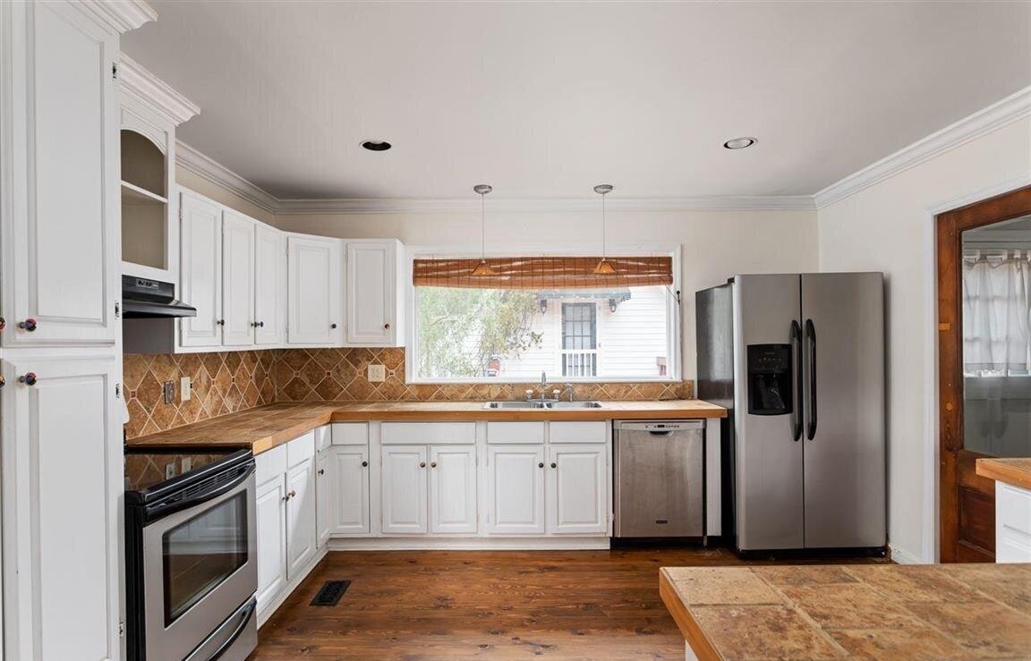
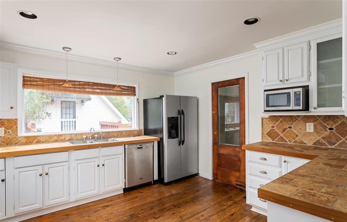
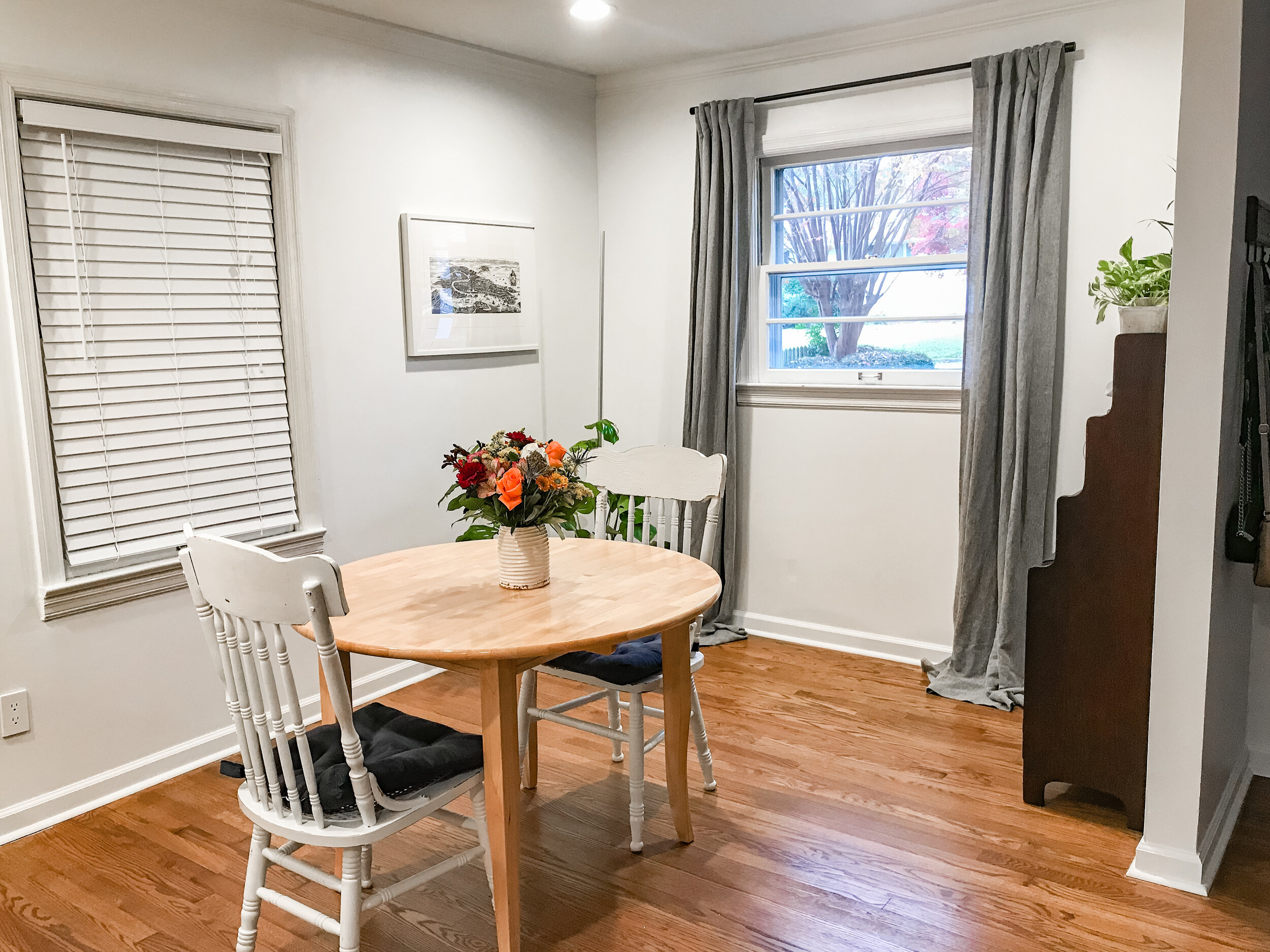
This is the area of our house with the most unrealized potential. The kitchen is large for a house this size and age, and a full renovation will make a world of difference to the house (and its resale value). Everyone who sees the photos says the kitchen looks great, but it photographs much better than it looks in person. When we moved in, the kitchen just received ceiling paint and lights; the rest of the room will be ripped out as soon as we can afford the remodel. The only changes in the dining room have been the window treatments and the same small upgrades that the rest of the house received: wall repairs, paint, trim, outlets.
Our plans in here: a whole new kitchen, designed by me! The layout is about as good as we can get in here, which will be good news for the budget. We’re going to take the cabinets all the way to the ceiling and remove the ones over the peninsula. As much as we cook, it’s going to be a huge quality-of-life upgrade.
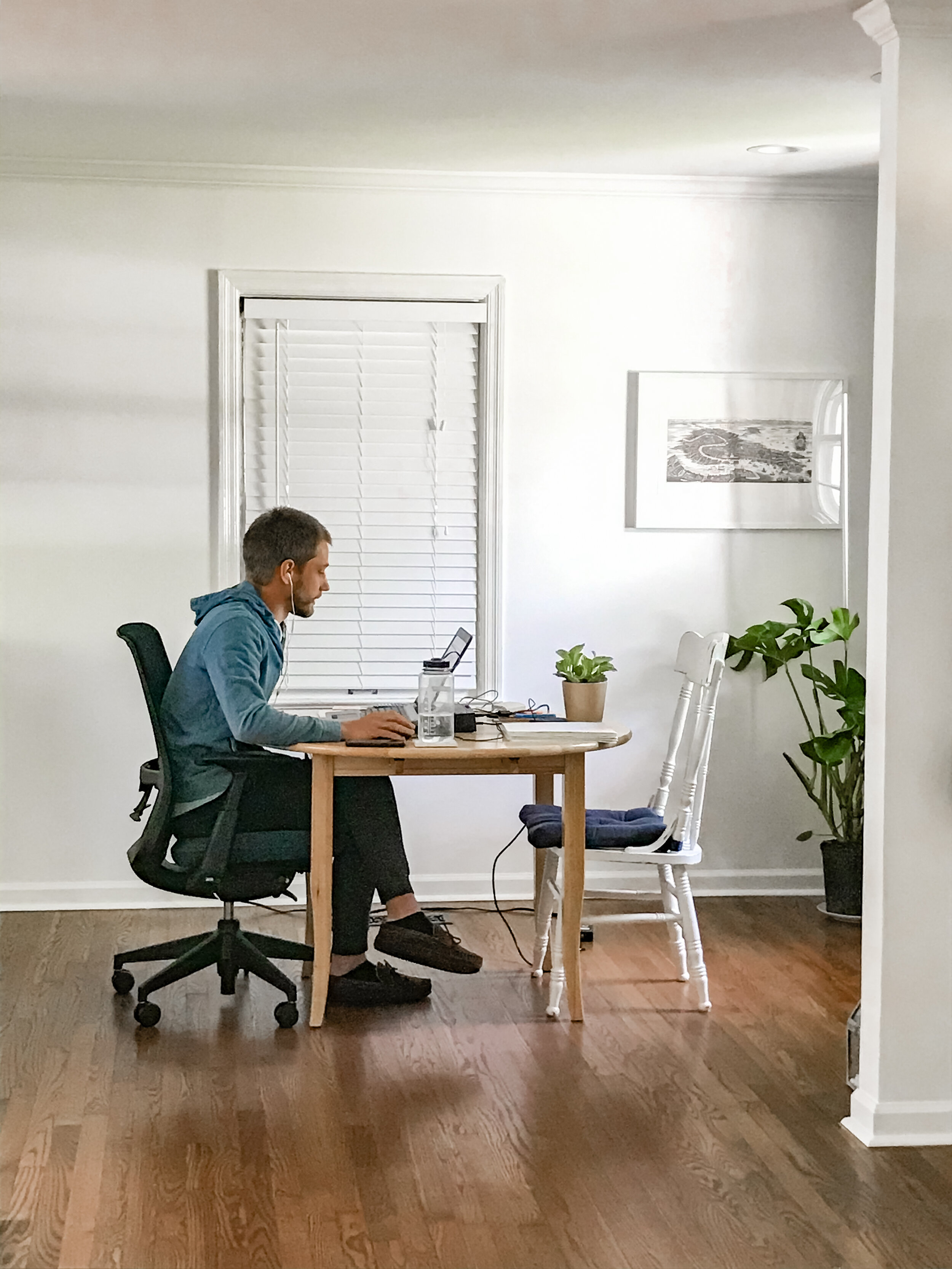
As for the dining, we intend to get a new table and chairs. However, there is currently a NASA engineer using the dining room as a home office, and it seems prudent to wait until that whole business is wrapped up before we purchase new furniture. I plan to add a pendant above the table, and maybe a buffet beneath the window. When we do the remodel, we’ll take out the window that looks toward the carport and close up that wall.
The Study
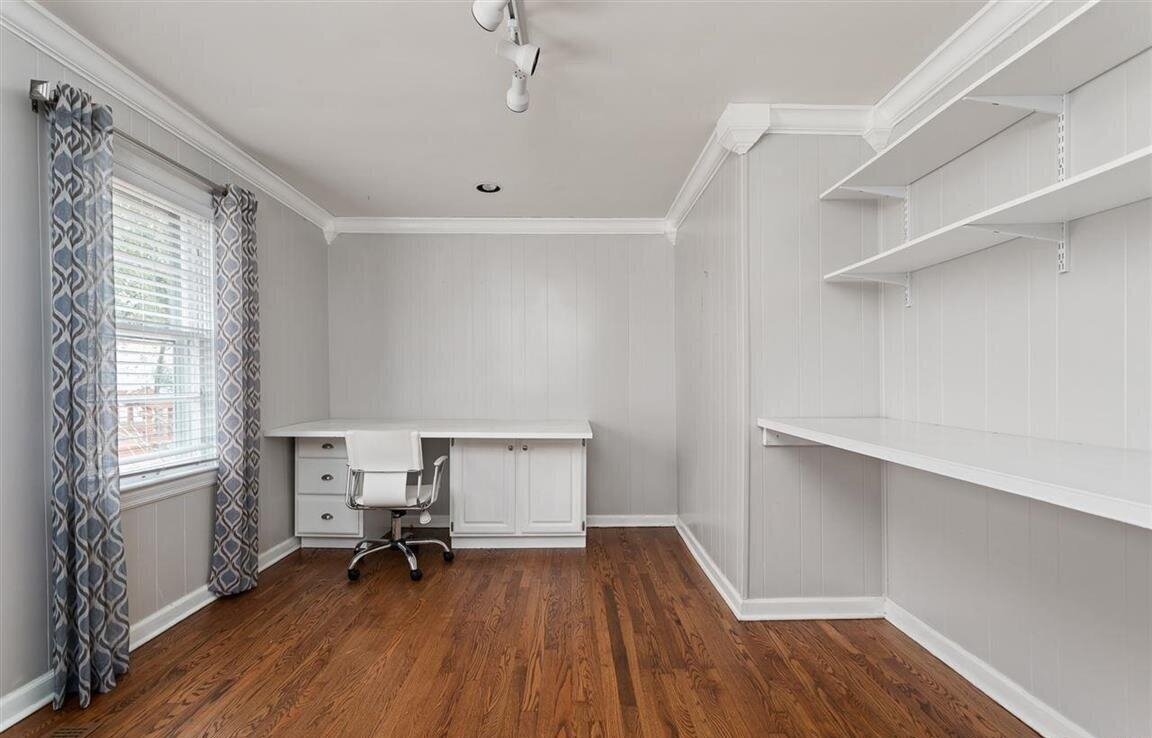
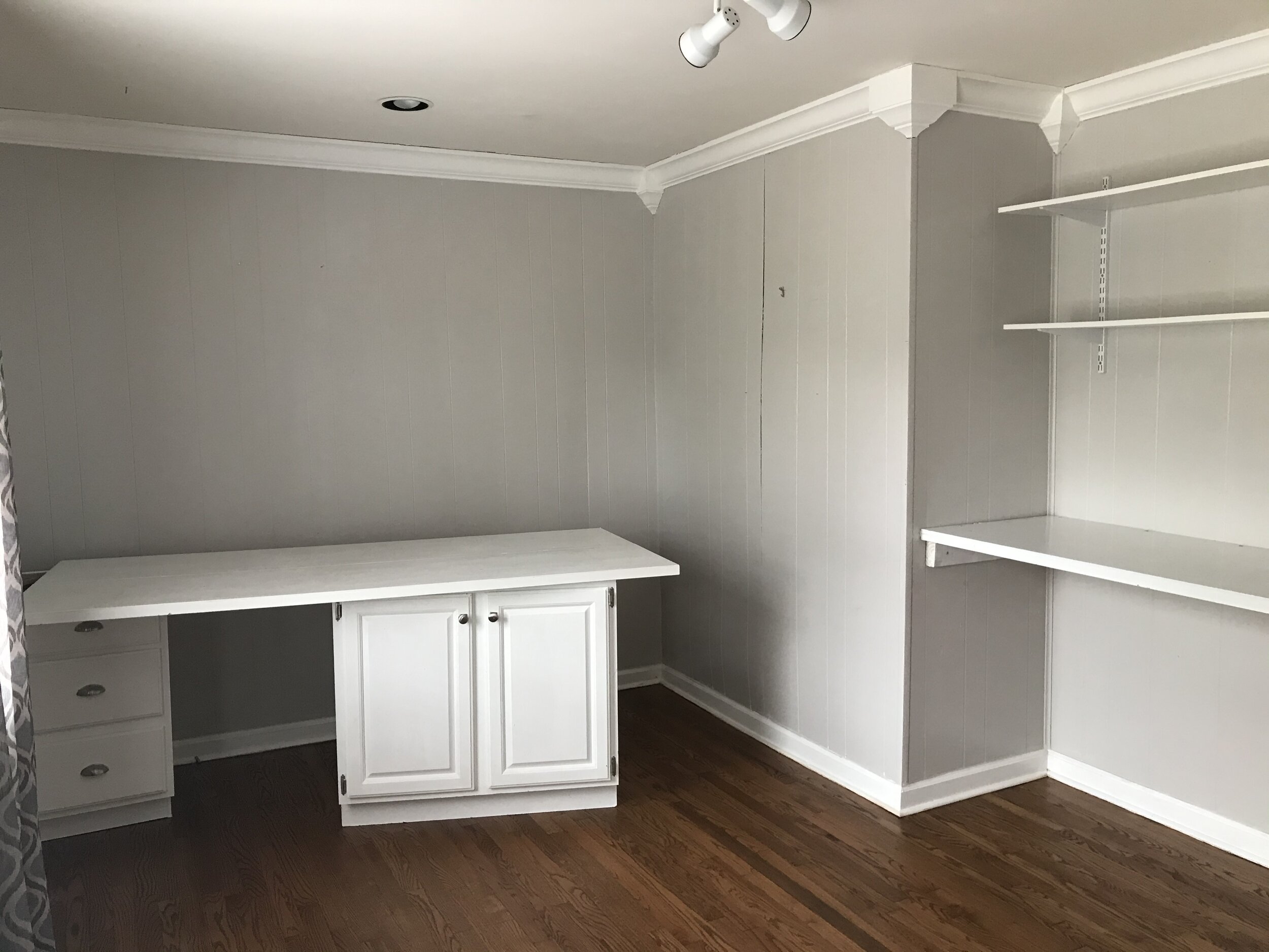
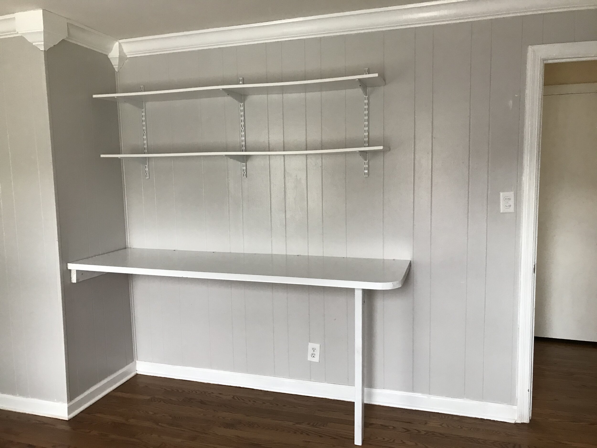
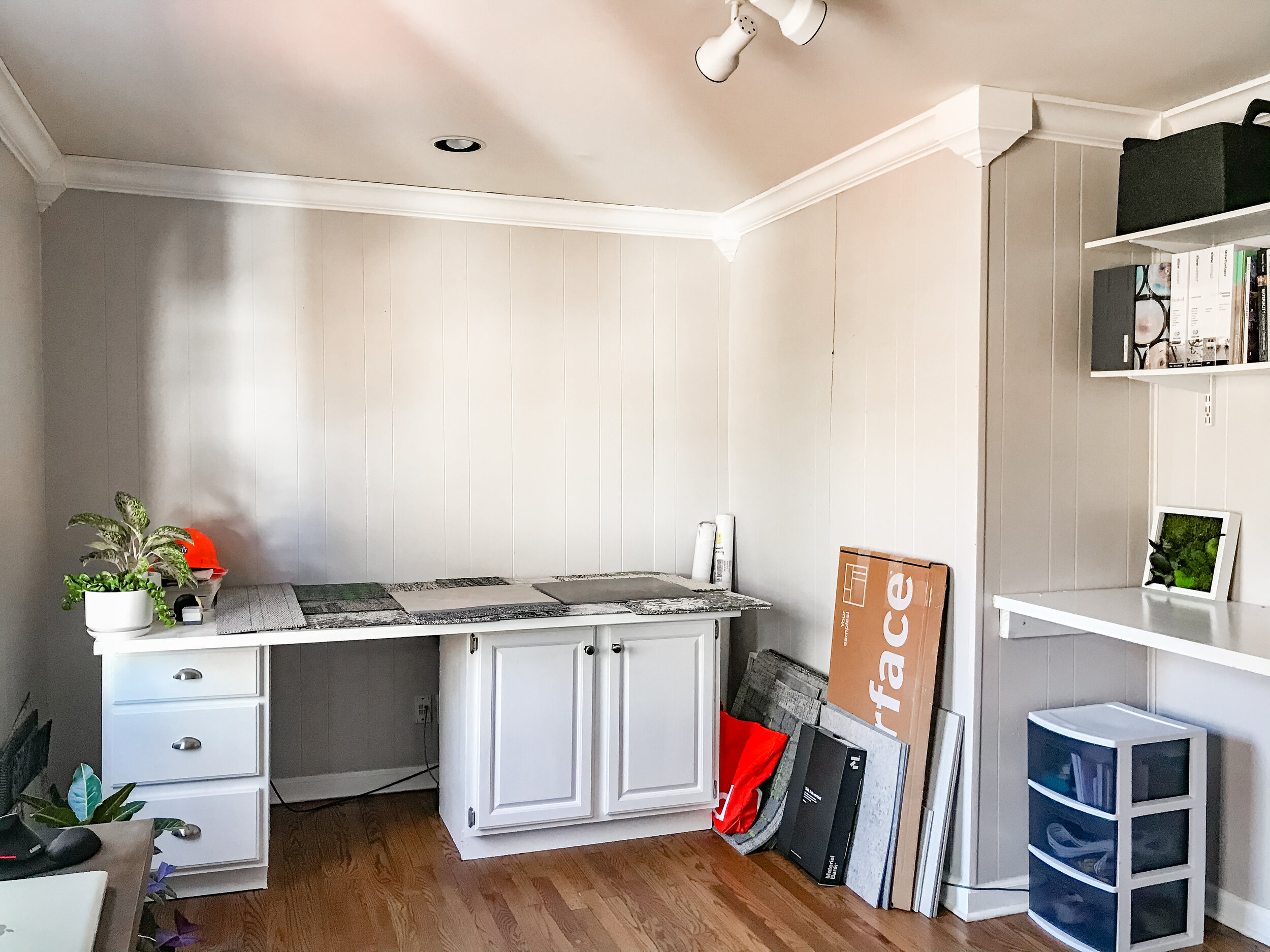
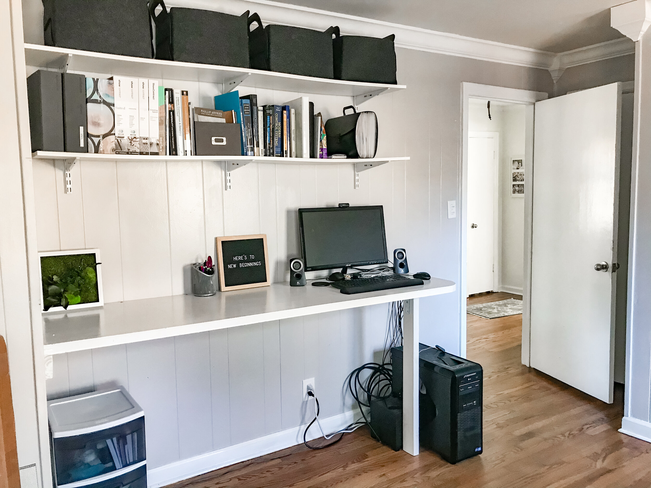
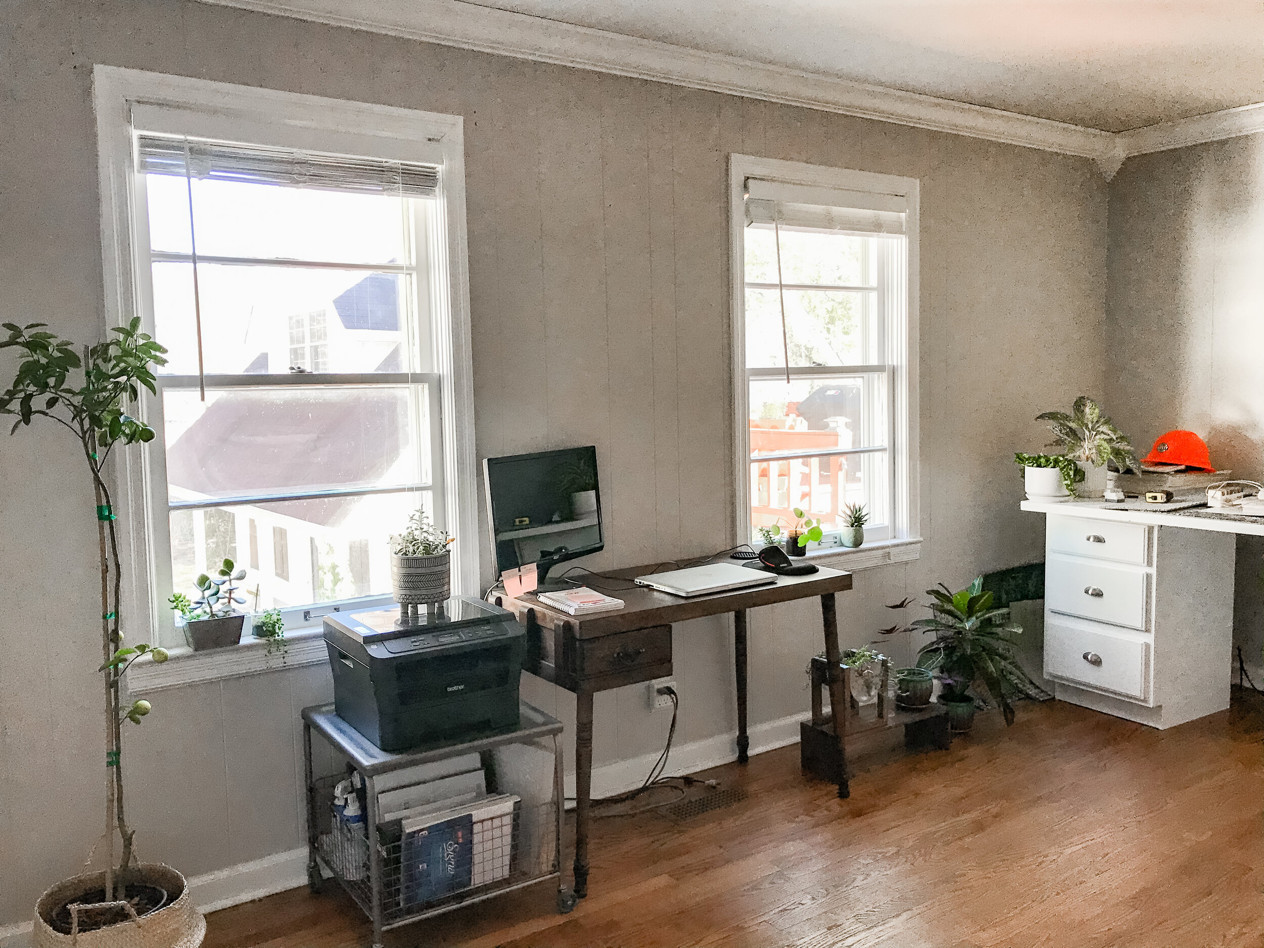
This room is where we kept all the tools and supplies during our first round of work, and it was meant to be our first project after move-in. However, there is currently an interior designer working full time in this room. I’m using the ad hoc desk (it’s a bifold door on some old cabinets that the previous owner left behind) for project layout space. It’s going better than I expected, and certainly better than it would if we were still in our apartment. Being able to shut the door on my stacks of samples at the end of the work day is a real blessing. All this to say, the project has been paused. I think it’s a good thing. Rather than rushing to get it done, we’re taking a beat to think about how we’d really like to use this room in the future.
We’ll definitely remove the paneling, and we’ll likely need to do some wall repairs after that. We’ll put in new trim and recessed lights to match the rest of the house. The room’s shape is a little funky because the chimney takes a bite out of it; we’re planning on putting a desk and open shelves into that narrow area. The existing open shelves will be removed, and I think we’ll add built-in cabinets there. The corner out of frame will get a cozy chair and a lamp to make a little reading spot.
The Guest Bedroom + Bathroom
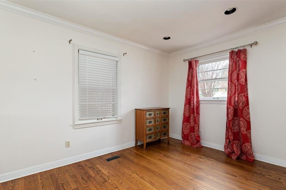
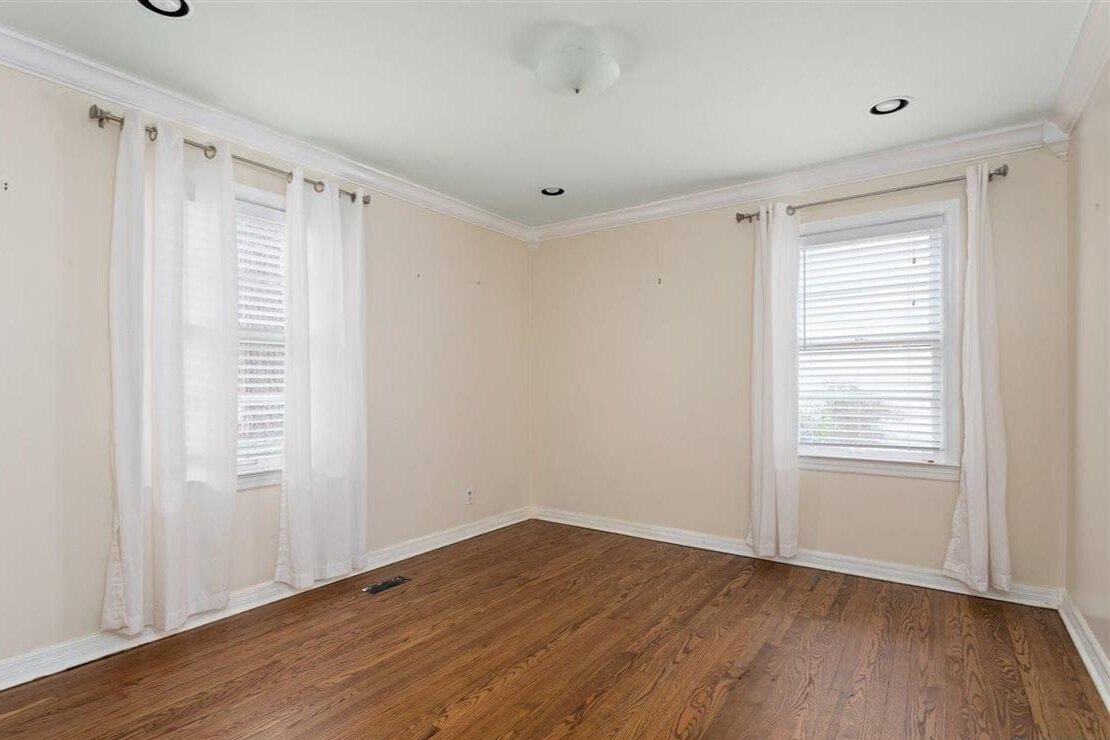
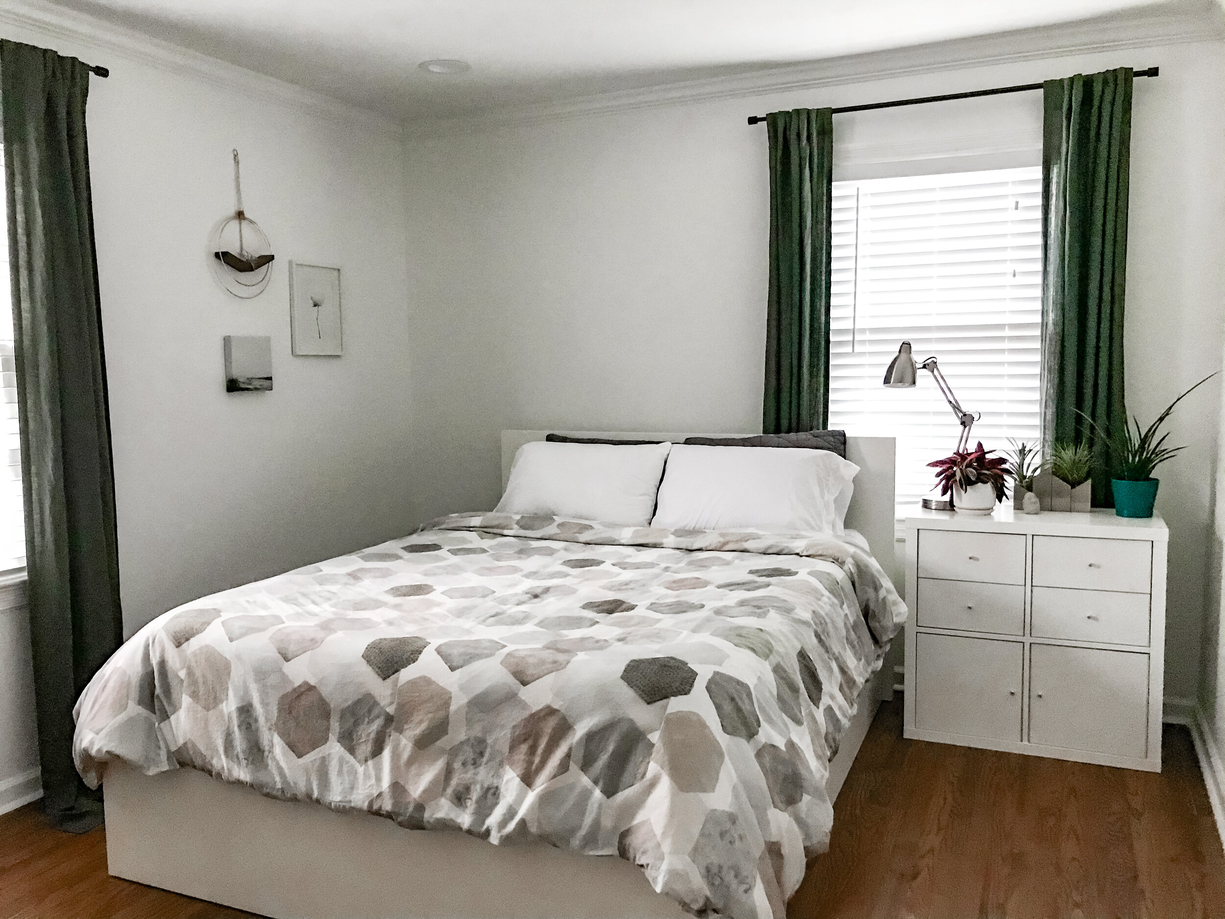
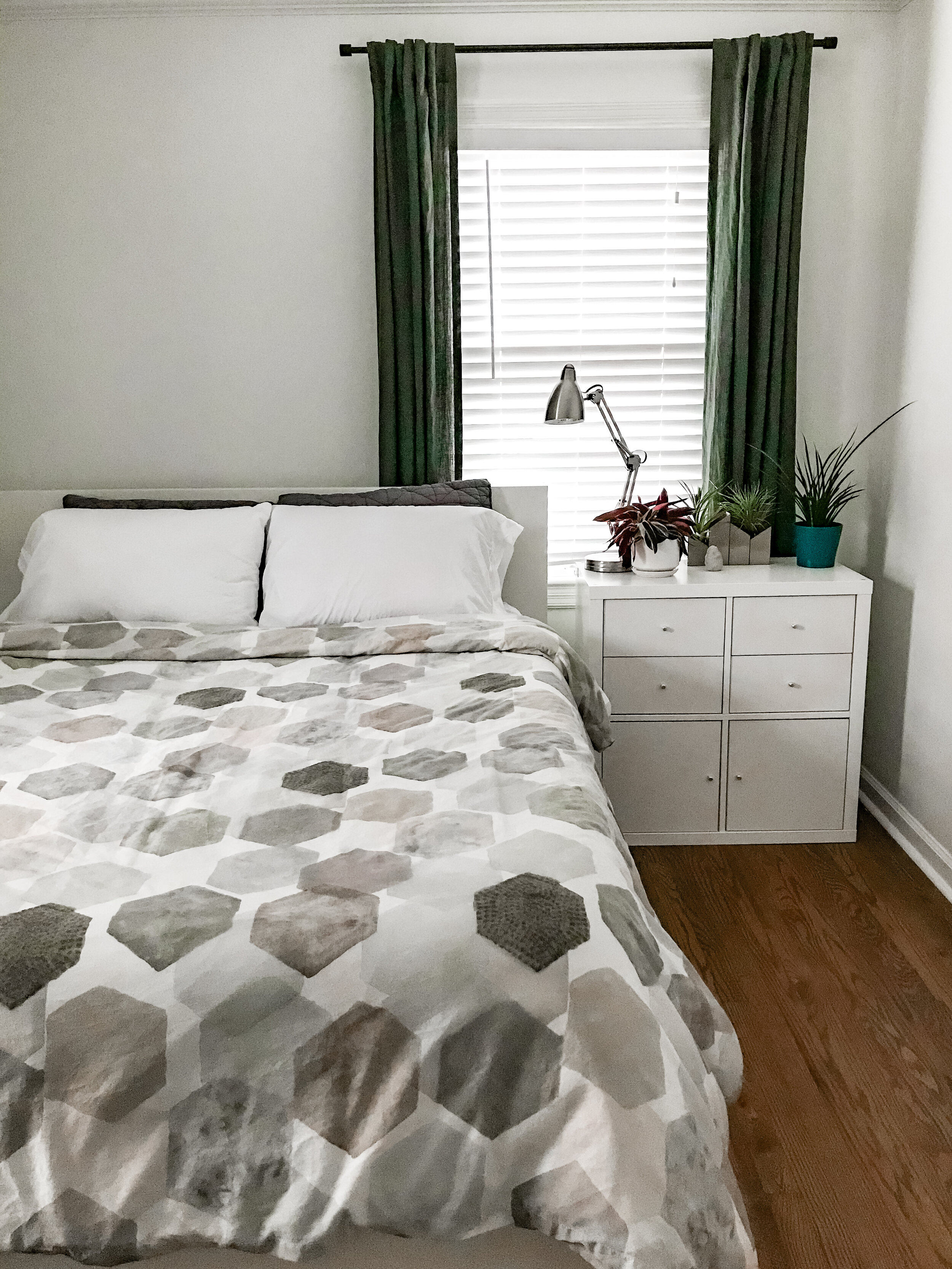
The ceiling was green, the walls were cream, and the whole room needed some love. The contractor skim-coated the walls, we installed new trim, and we painted everything the same white as the rest of the house - Sherwin Williams Pure White. It’s currently the resting place for most of our old bedroom furniture. It doesn’t photograph well, but it’s a very cozy little room. I often wander in during the afternoon, when it gets really lovely light. One of the sad things about this year is that we haven’t hosted a guest yet.
Plans in here: adding more character through art and accessories. I look forward to adding to the little gallery corner over the years. Eventually, I’d like to update the furniture, but that’s so far down the list that I can’t even see it from here.
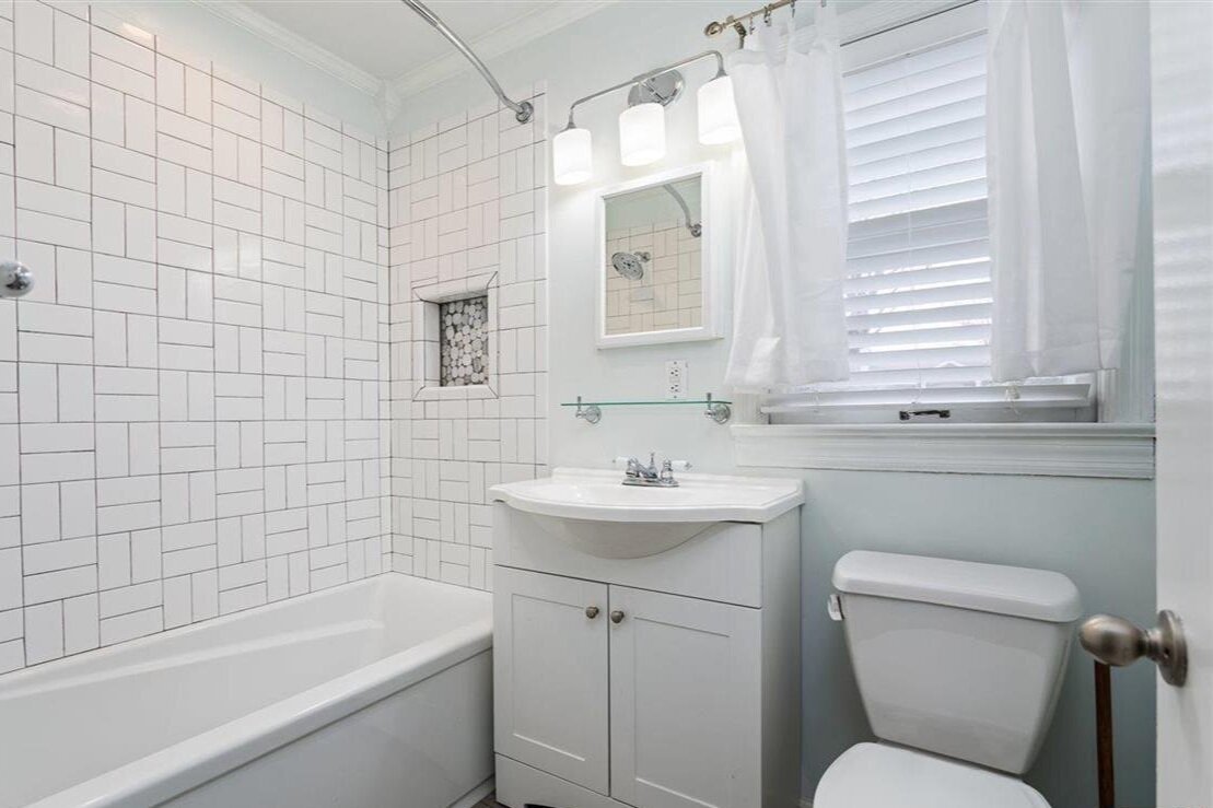
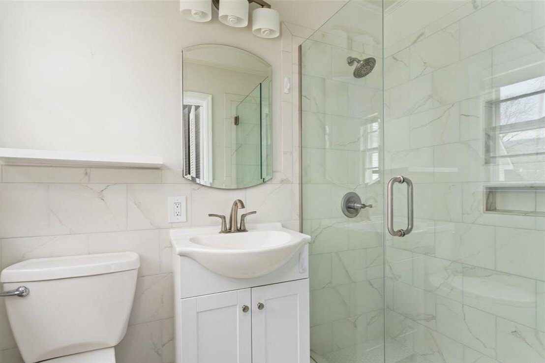
The guest bath was redone fairly recently. It isn’t what I’d choose, but it’s close enough that I doubt we’ll redo it. However, I will do a mini-makeover at some point - repaint and swap the fixtures, sconce, and medicine cabinet. When we redo the windows, we will put in one with obscuring glass so we can get rid of the blinds. I did take down the curtains, because… ew.
Sources Art: landscape & peony | Curtains: West Elm | Curtain Rods: CB2 | Duvet: West Elm, discontinued (similar)
Master Bedroom + Closet + Bathroom
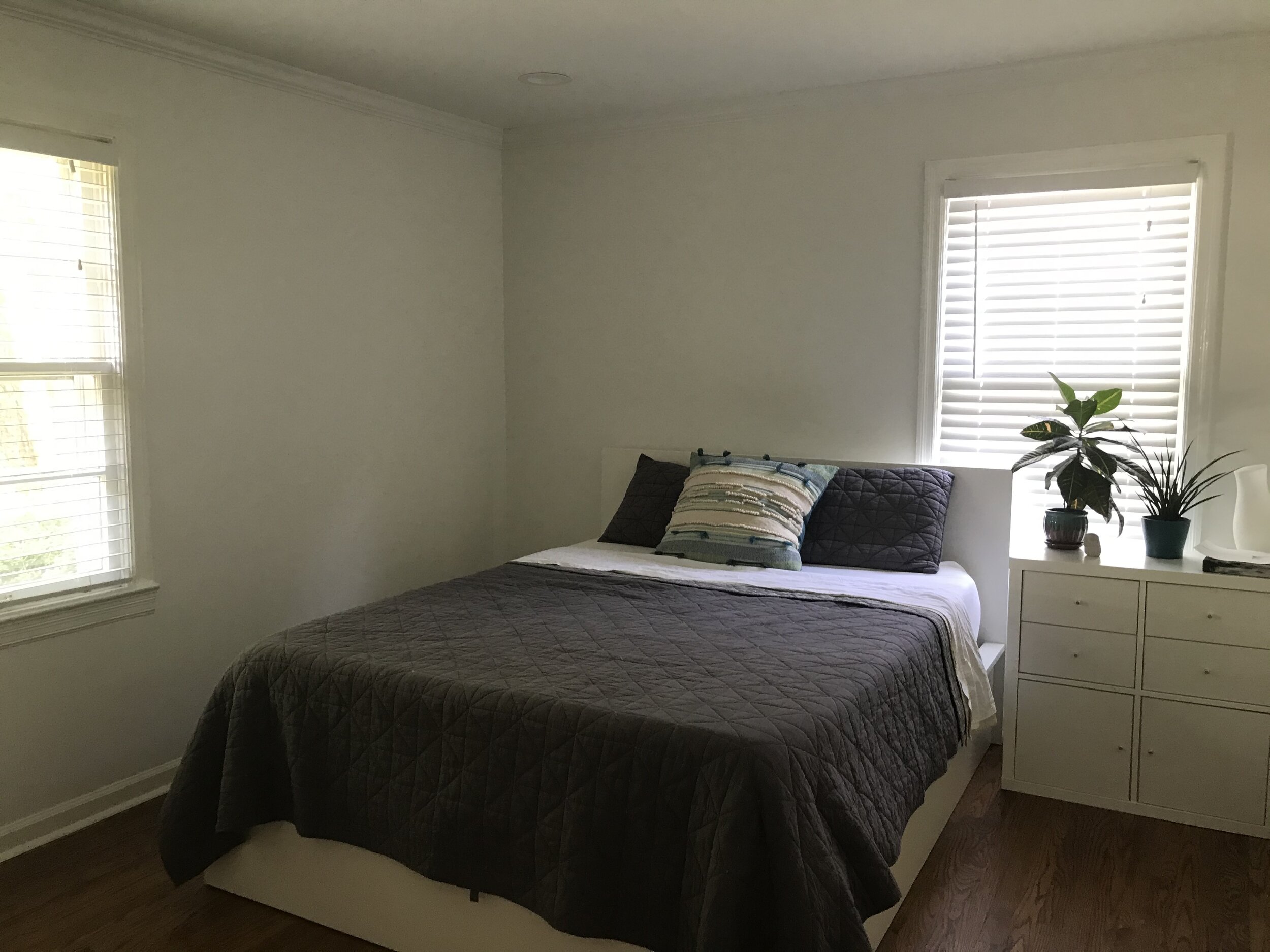
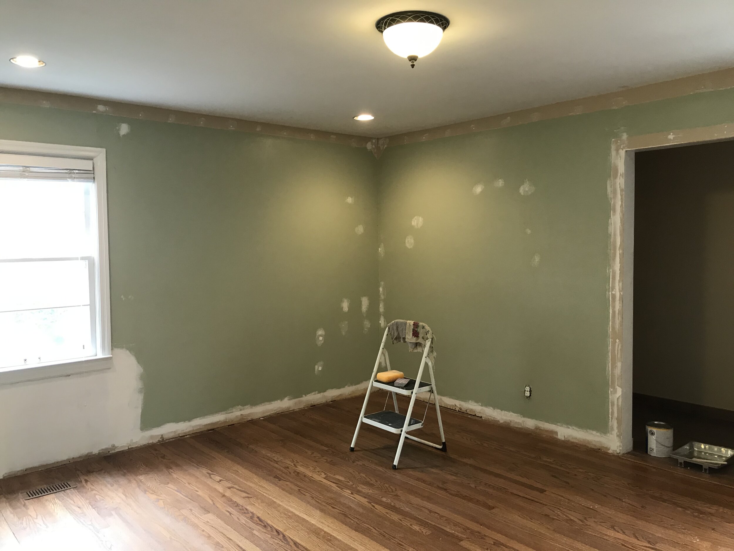
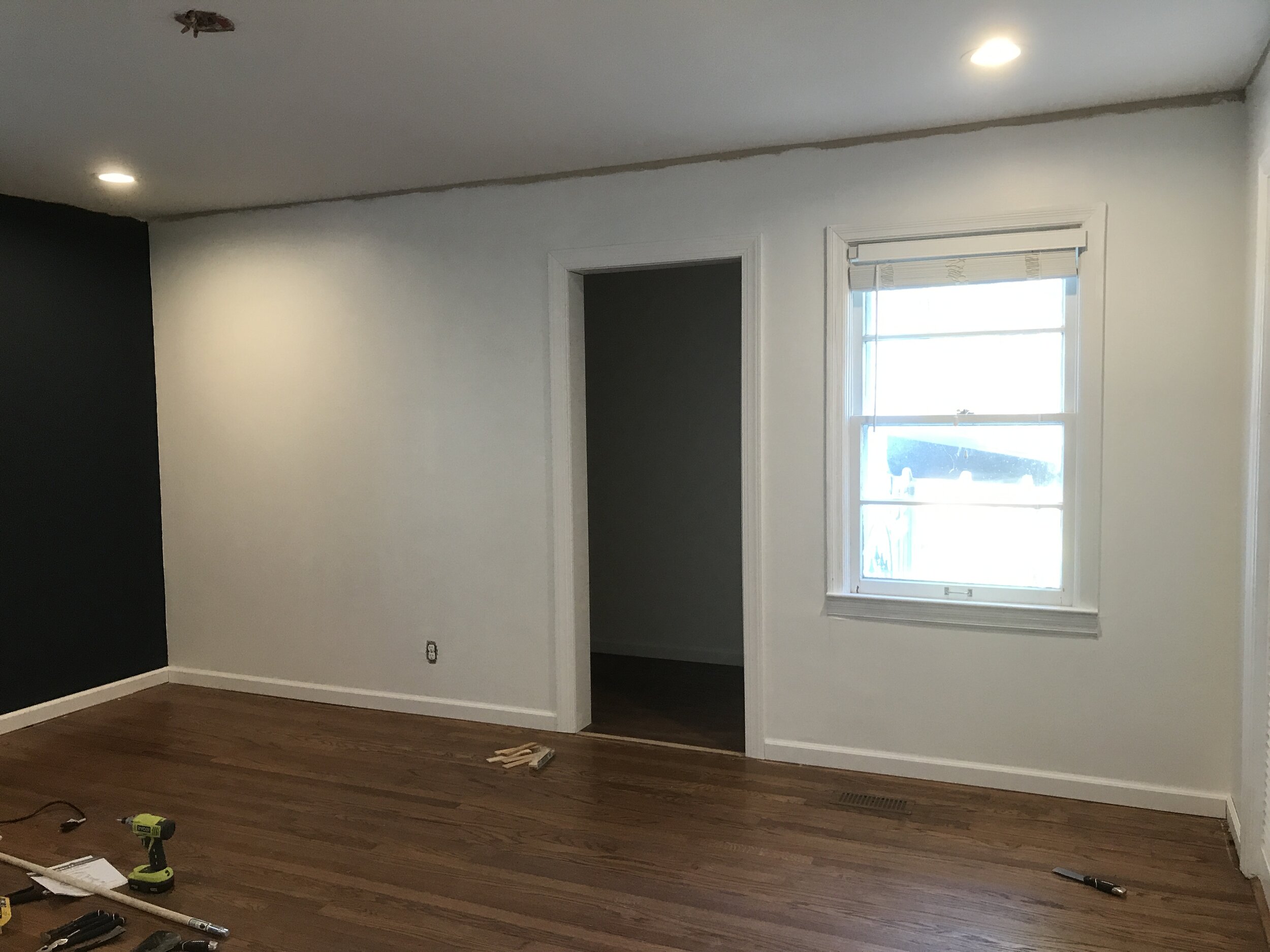
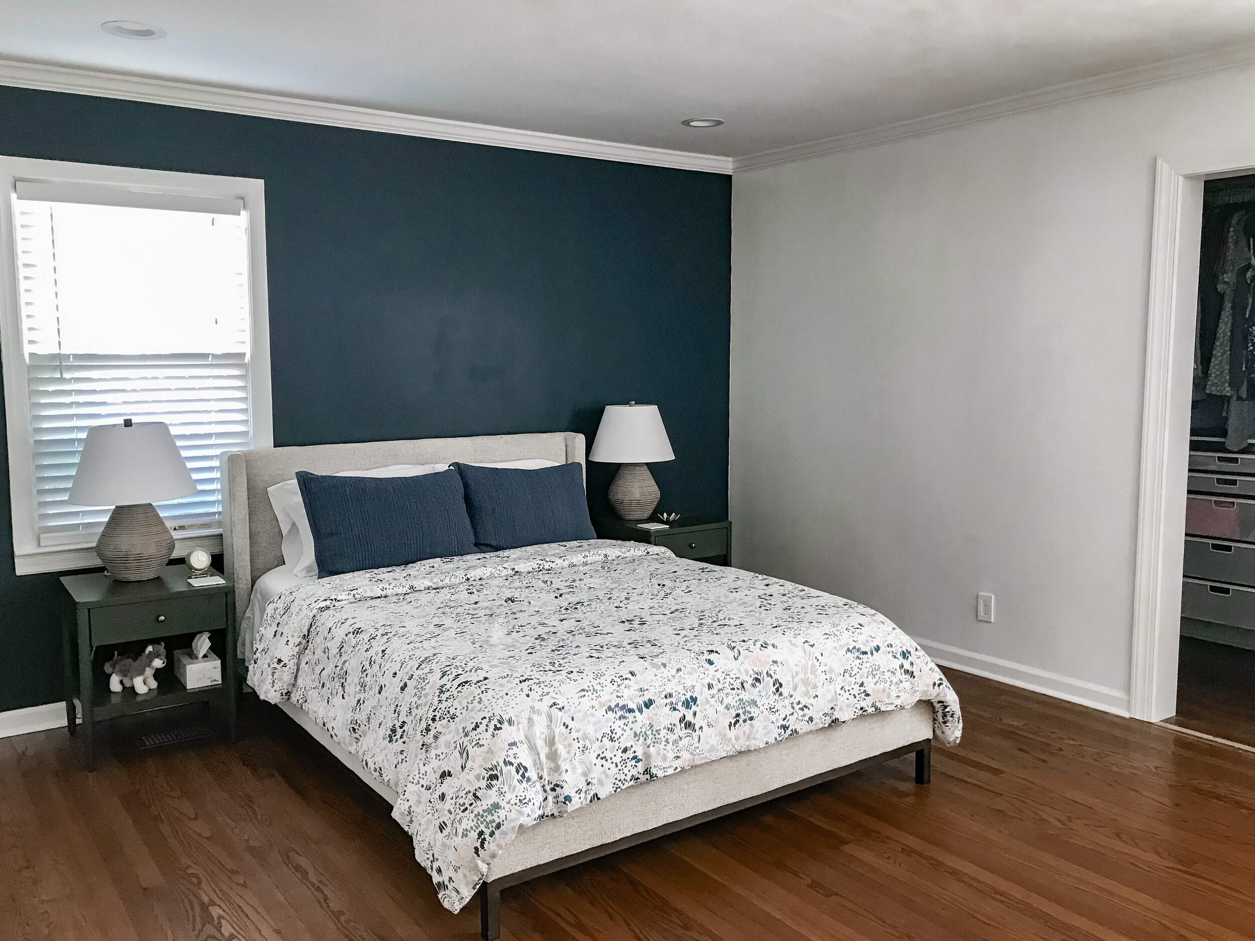
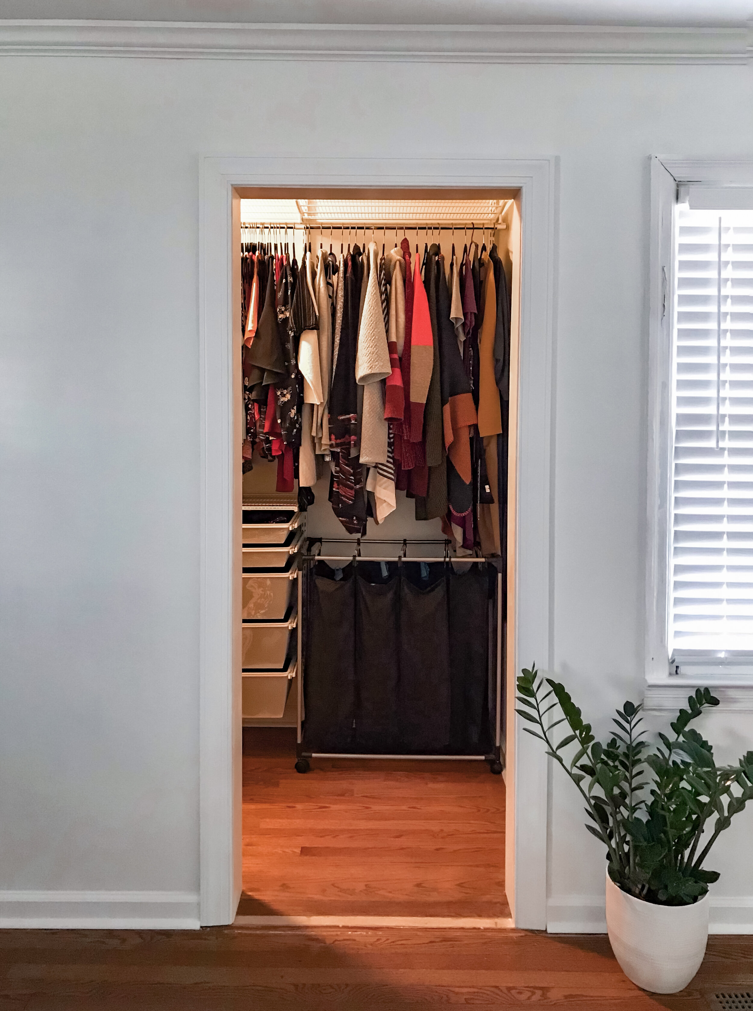
This room wasn’t photographed for the listing, but we’ll start with a photo I took of it in the midst of wall repairs. Like everywhere else, this room got new trim and lights. We removed the bifold closet doors and created a cased opening; we keep our closet tidy enough that we don’t miss the doors.
This is another room that I just wanted to get good enough for now. It’s nowhere near it’s intended glory. Eventually, I’d like to use this wallpaper behind the bed, but we’ll be tearing out the trim around the windows when we replace them. In the meantime, I decided to paint the wall close to it’s intended color (it’s Sherwin Williams Gale Force in a flat finish), and I got a patterned duvet to add some interest.
I think we’ll add a low bench at the foot of the bed and a dresser across from it. It needs window treatments - another thing we’ll do after we get new windows. I have yet to put up any art or choose a rug. It’s incomplete, but it feels okay for now. It already has more style than any of the apartments we lived in before this.
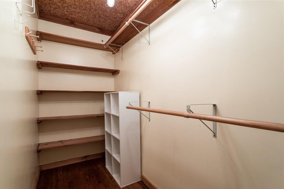
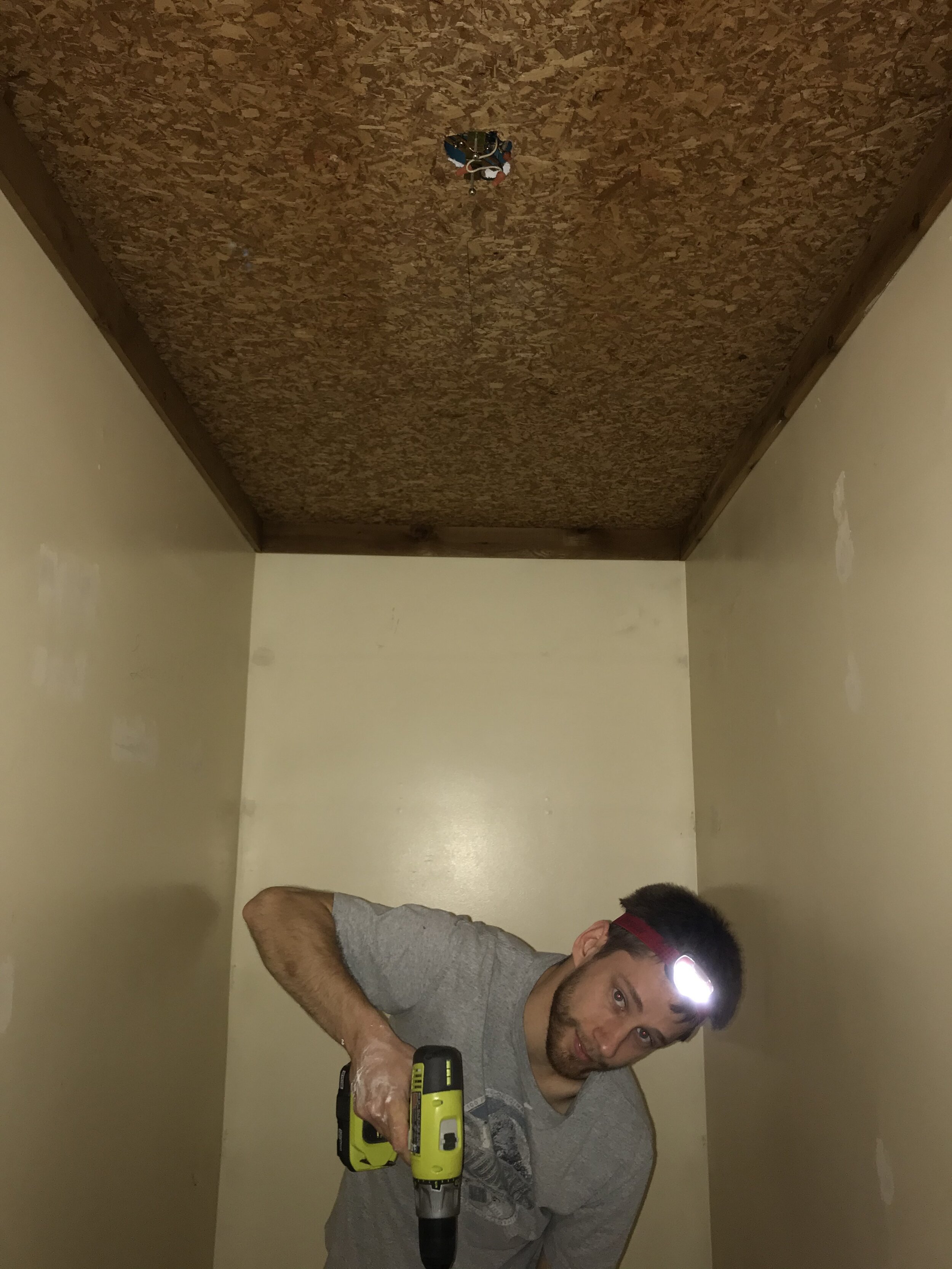
As you can see, the listing did include a photo of the lovely closet, which was part of a small addition to the house - someone added this closet and a small shed behind it. Do I wish the previous owner had dreamed a bit bigger and done a nice en suite? Sure do. But instead we inherited this thing, with an OSB ceiling and a light fixture that turned the tiny room into a hot house.
Here lies our biggest regret to date: we tried to skim-coat the ceiling. We watched so many youtube videos about drywall that we were terrified of messing it up. So we decided to try to skim it as practice for the other walls. (We ended up paying a pro to do that. This is why.) Joey did the best he possibly could, but by the time it was dry, sanded, and painted, we lost a lot of valuable time, and it doesn’t even look great. It does look a lot better, though, and who really looks up when they go into a closet?
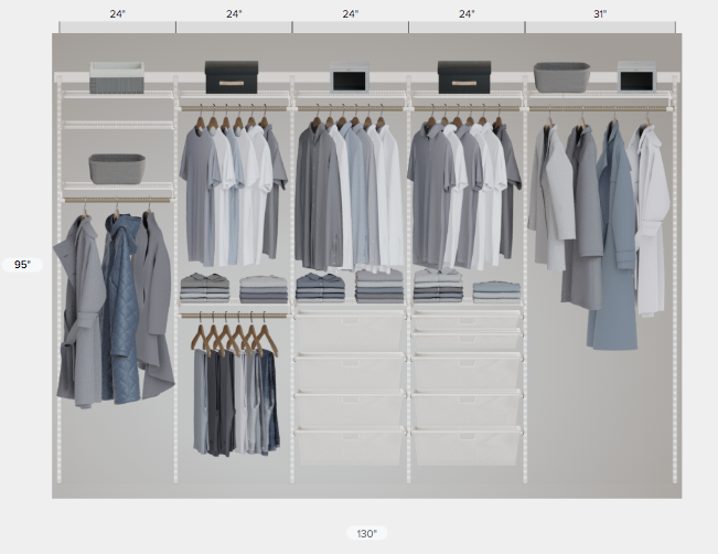
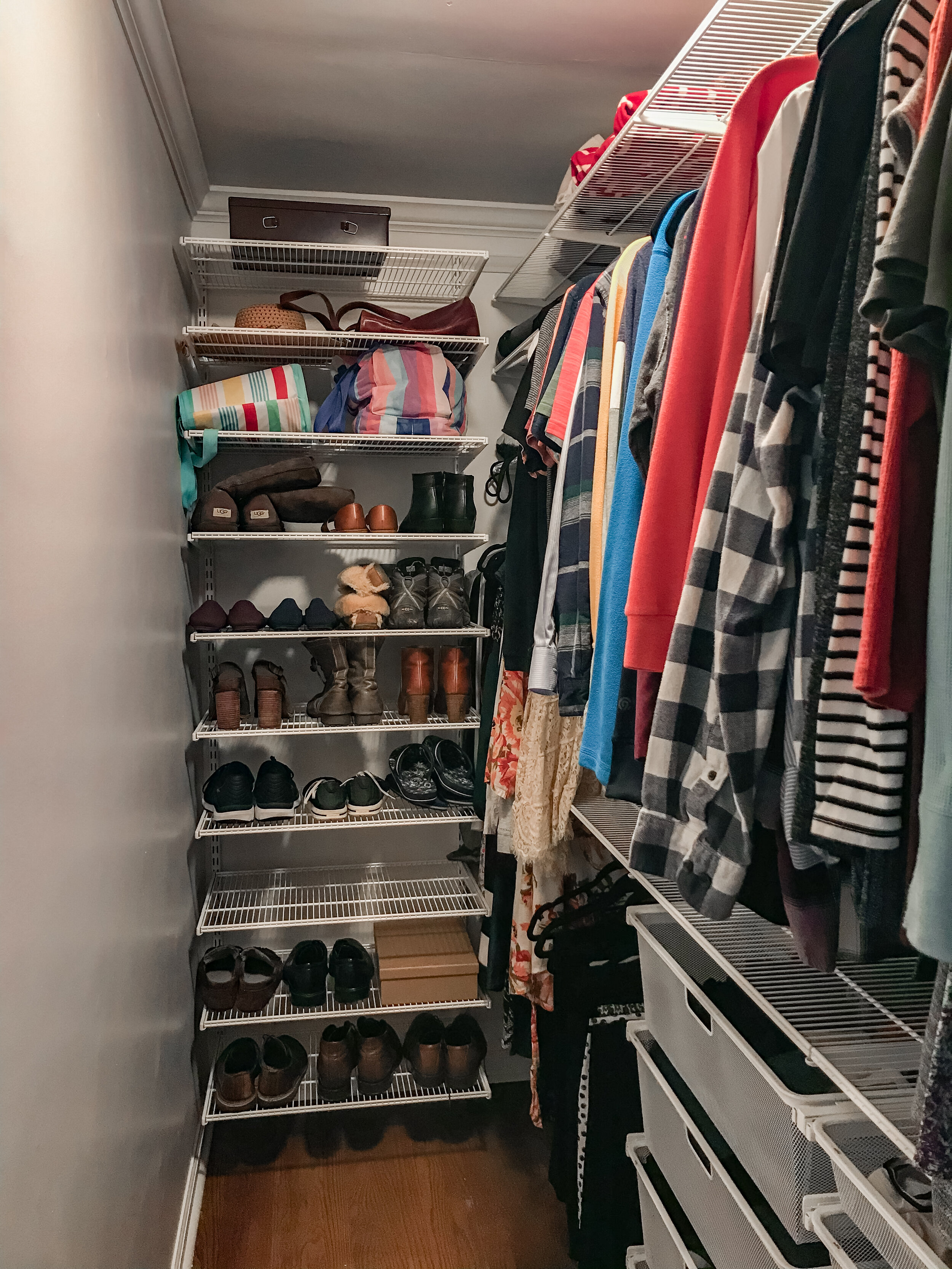
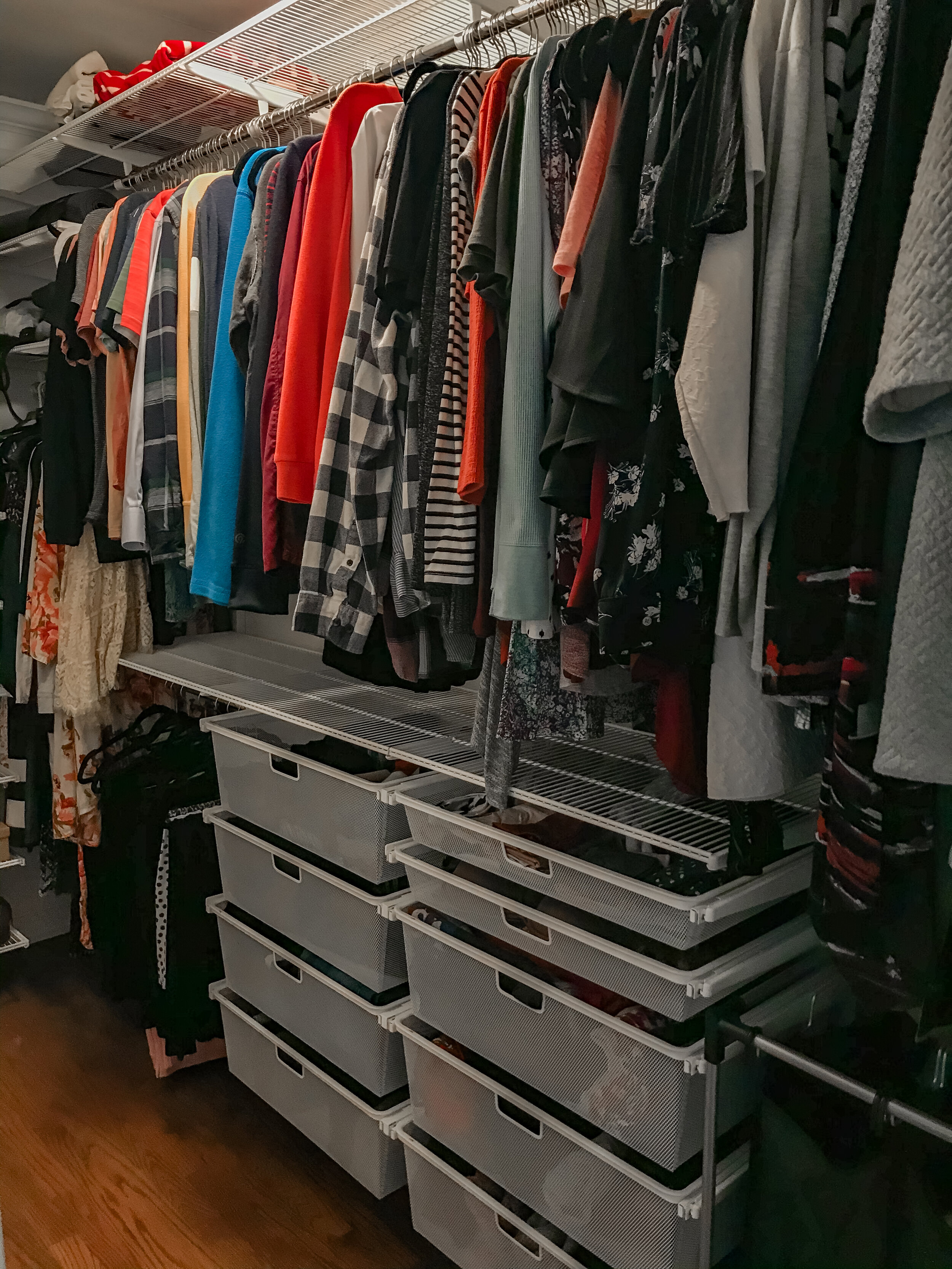
I think the best money we’ve spent on the house so far was the closet system, which is The Container Store’s Elfa System. I used the measurements of the closet to create a custom design with their online closet design tool, which I’m plugging here because I loved it so much. At the end, I just hit “purchase”, and it all showed up on our doorstep in about 30 different boxes with all the hardware included. The install process was not nearly as easy as the online videos made it seem; but I’ll admit that we were installing in the middle of the night at the tail end of a month of struggles, and we were not at our best. Nine months into life with this closet, we couldn’t be happier with how it turned out - it really makes the most of the narrow space.
Finally, the bathroom: another recent remodel that I have no intention of changing. It’s a tiny bathroom, but pretty well done. All I’ve added is some art and plants. It’ll probably get a mini-makeover eventually and get a new sconce, medicine cabinet, and vanity. But I’m in no rush.
Sources Bed: Lulu & Georgia | Shams: West Elm | Nightstands: Crate & Barrel Kids | Lamps: Target | Ceiling Fan: Home Depot | Closet System: The Container Store
The Backyard
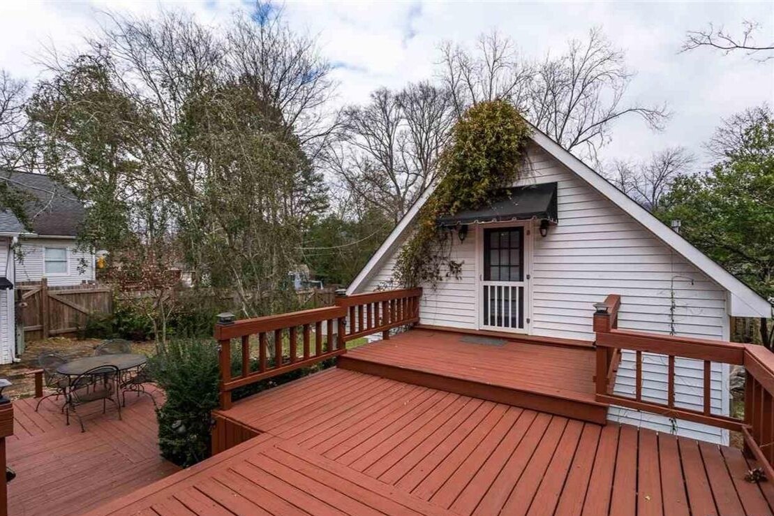
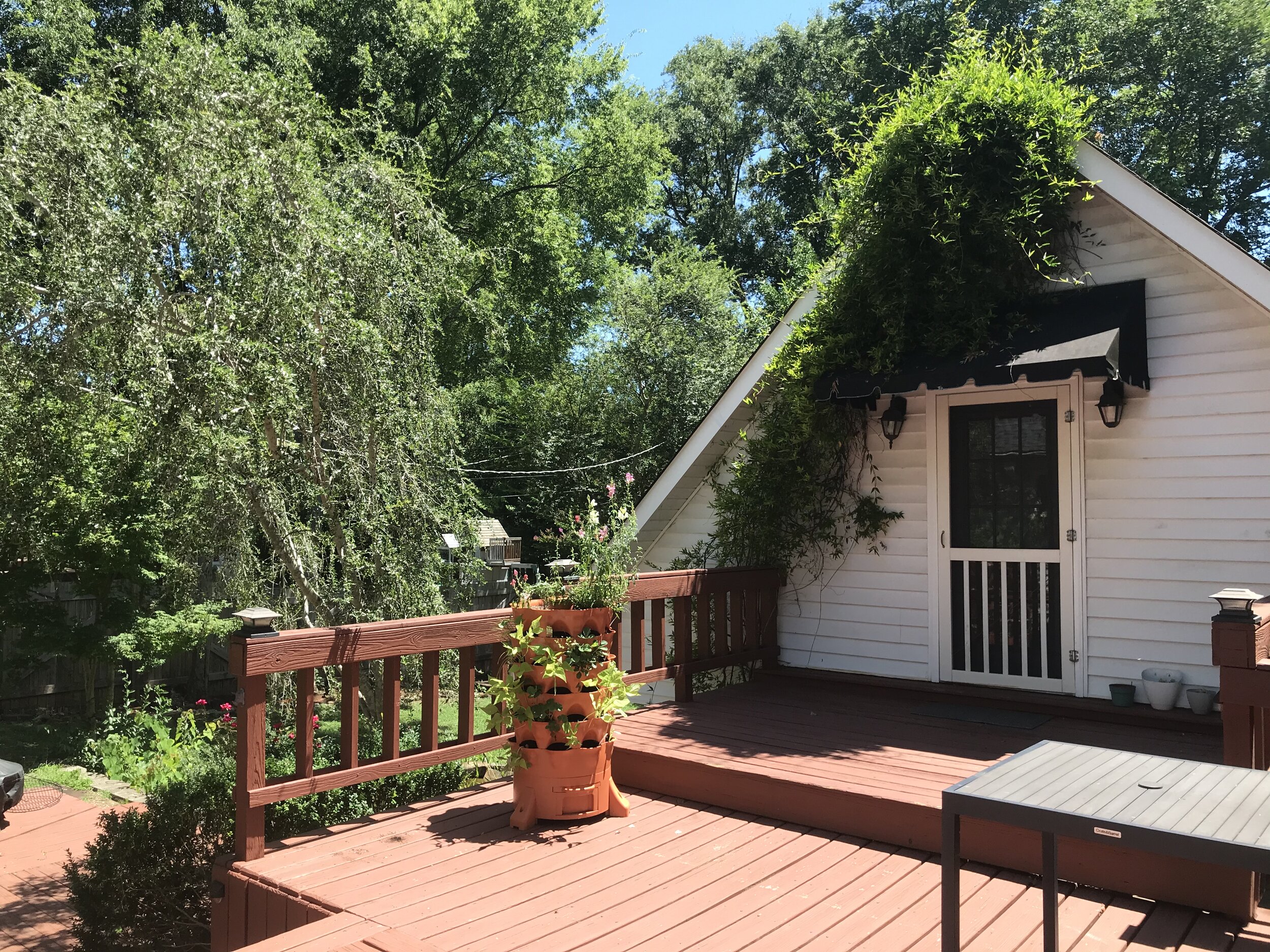
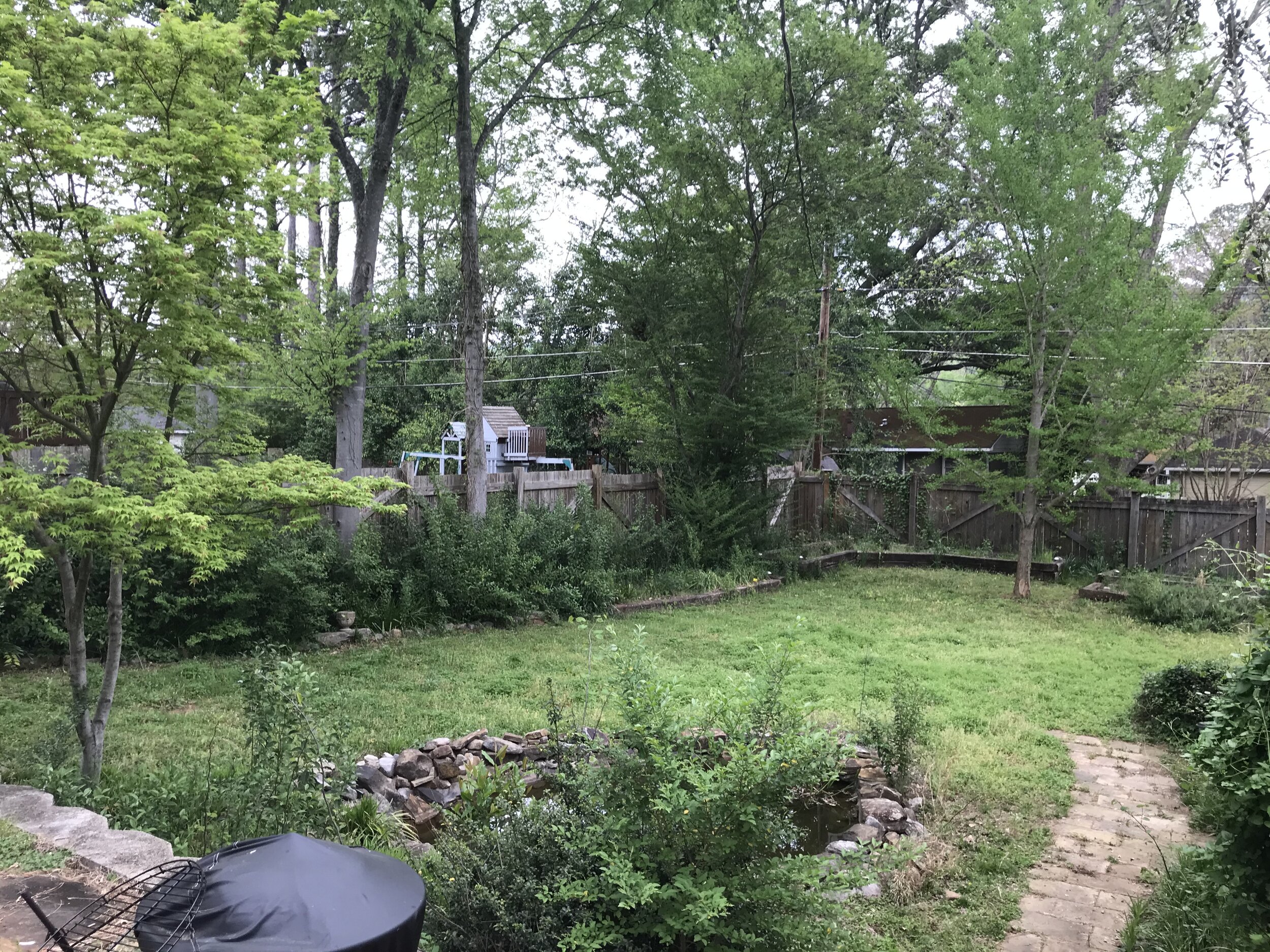
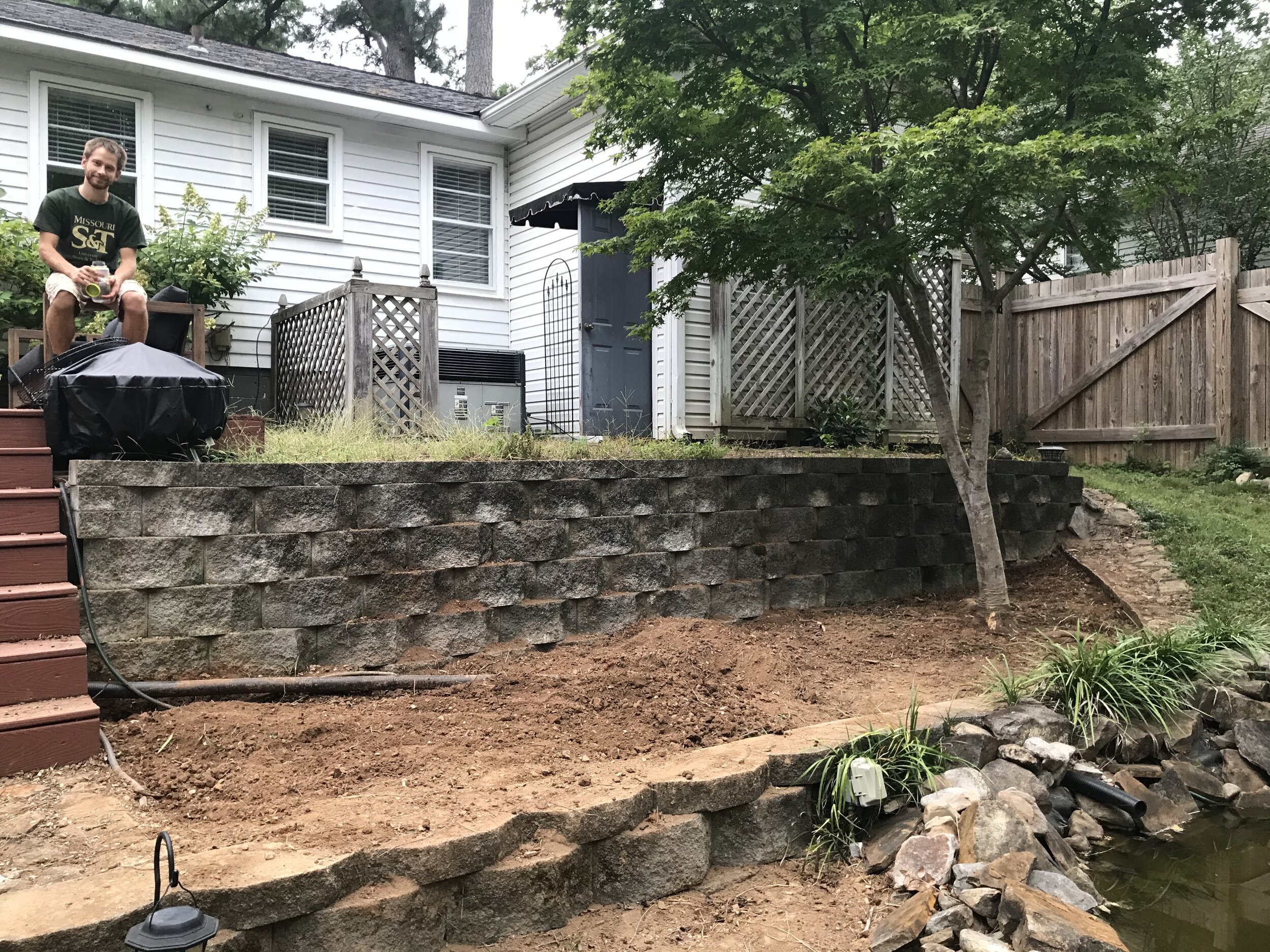
Stepping onto this deck for the first time, I said, “Oh. This is our house.” We joke that we bought the house for its backyard.
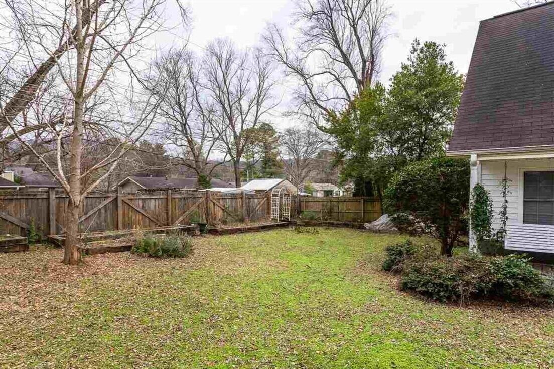
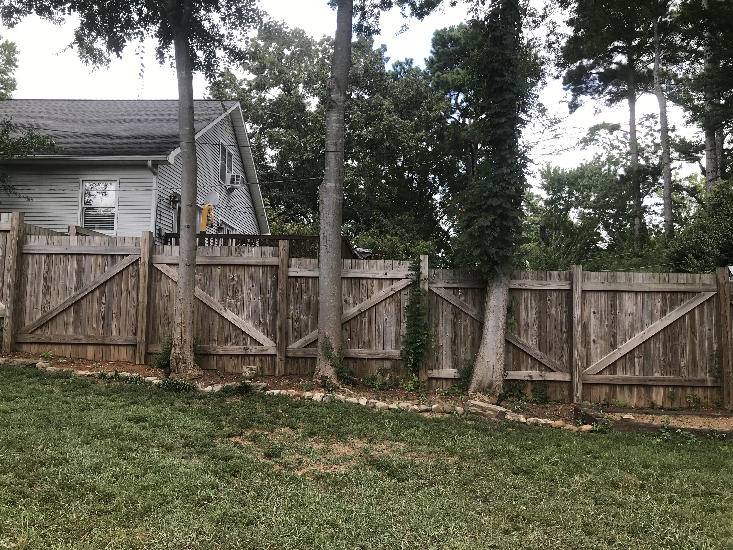
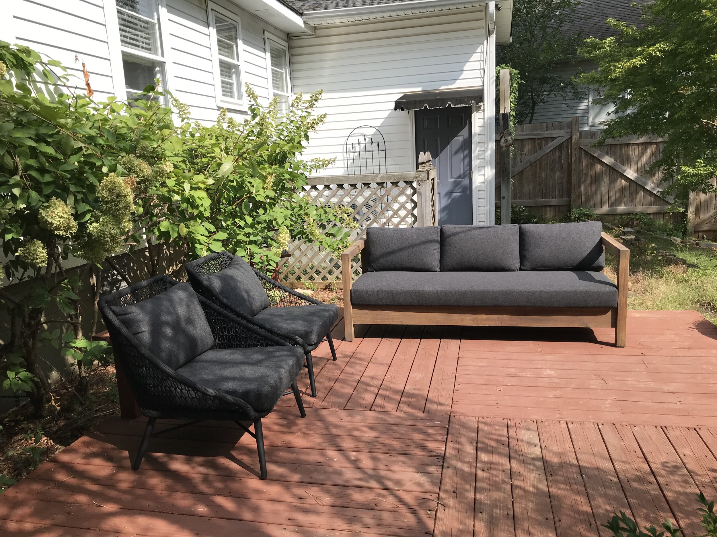
We love this yard. In the summers, it gets gorgeous light. The tree coverage offers enough shade on the deck that summer dining and lounging is pleasant. Despite touching five other yards, it feels private. There’s a ginkgo tree, which feels like fate, because they’re my favorite. The raised beds will hopefully give us plenty of vegetables over the years, though we’ll be doing serious warfare with birds and rodents.
The deck and yard have so much potential, but everything was neglected and overgrown. Joey spent many weekends this summer and fall digging up all the overgrowth, most of which was quick-growing invasive species. The result is for now, a blank slate. Our only firm plan is for the cut flower garden that I’ll be attempting this spring. That bed has been fully cleared out and prepared for its new life with a good dose of compost. The multitude of landscaping beds are begging to become a beautiful cottage garden, if I can just figure out how to make that happen. I feel a little out of my depth when I walk around back there. I’ve thought a few times that this must be how a lot of people feel about the interiors of their houses - I know what I like, I see the potential, but I’ve got no clue how to bring it to fruition.
Sources Table: Crate and Barrel | Sofa: Article | Lounge Chairs: Article, discontinued (similar)
The Guest House + Workshop
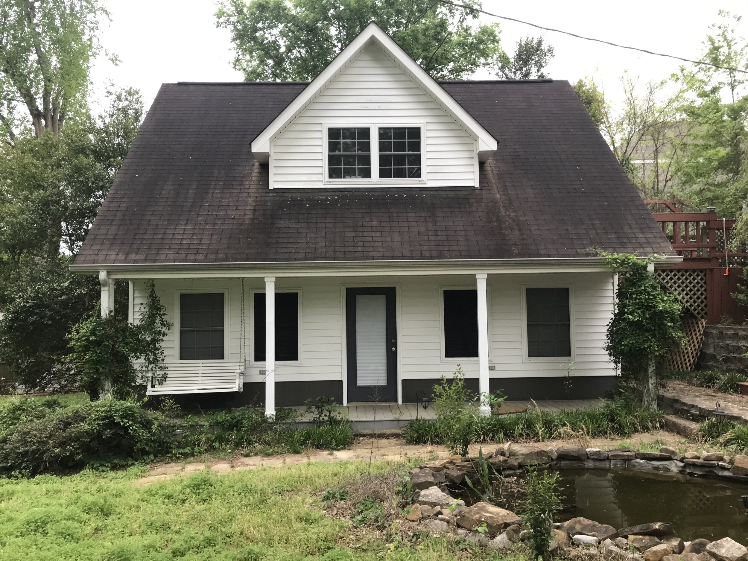
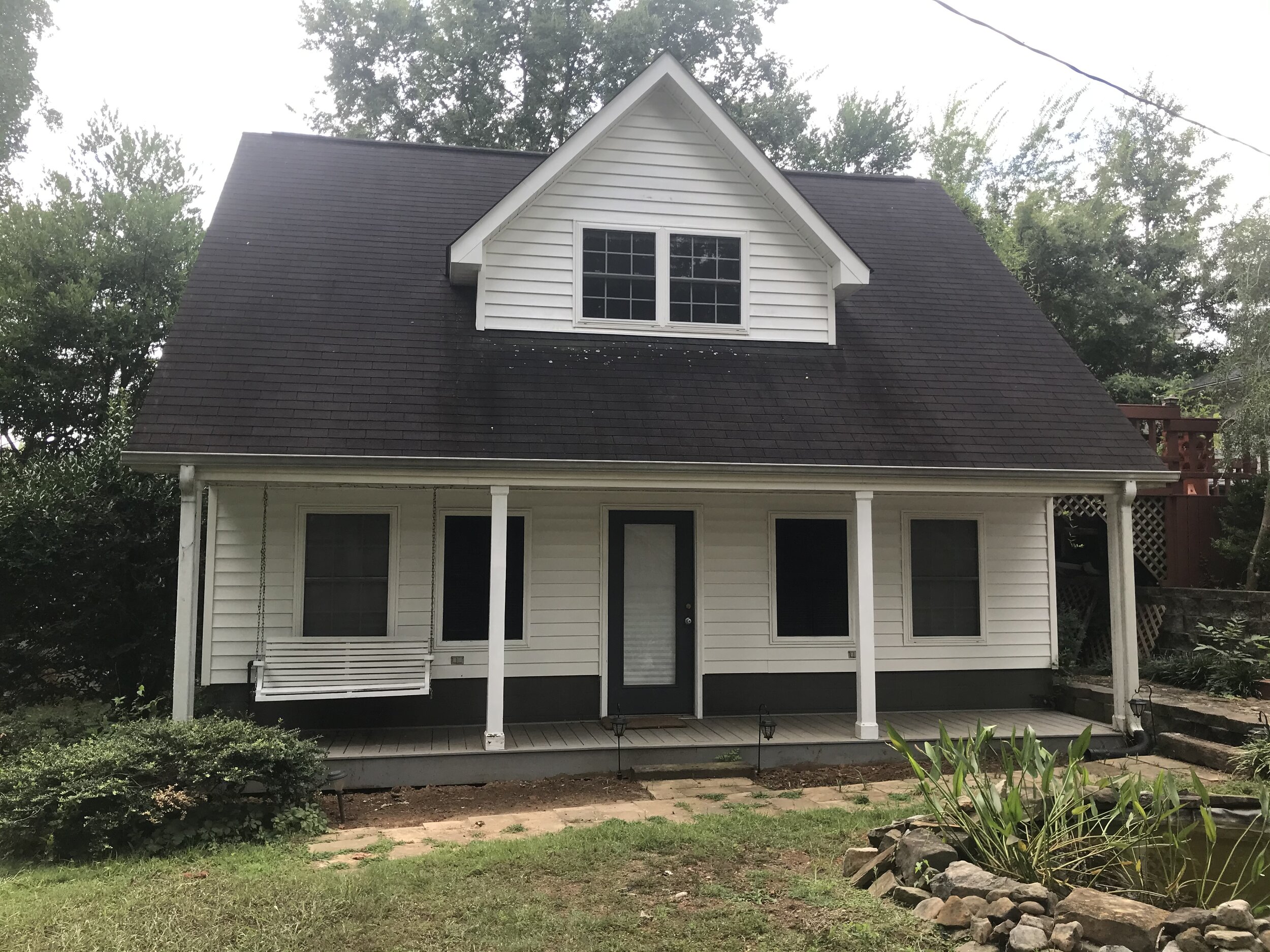
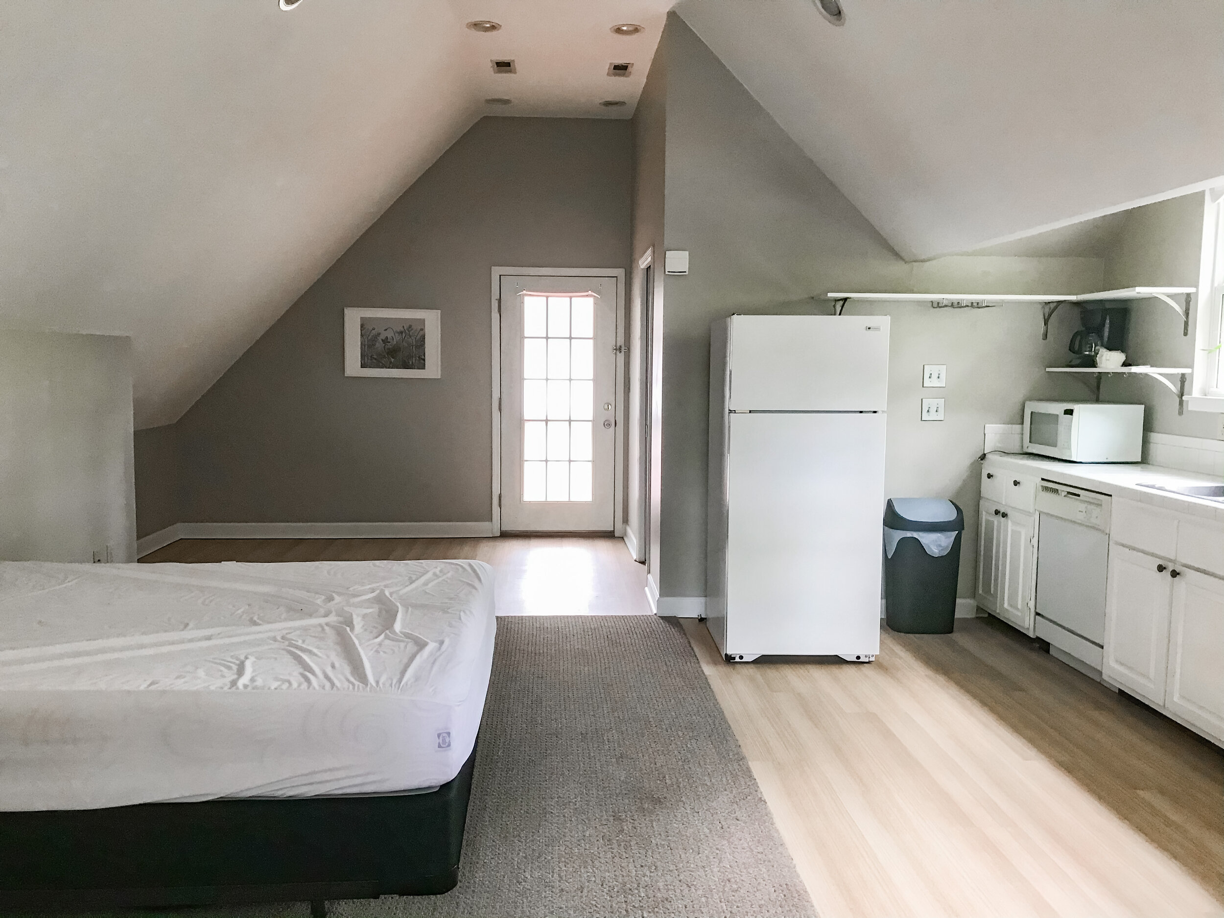
The guest house was the element we didn’t know to look for but sealed the deal once we found it. We’re far away from our hometown and family, and the thought that our parents could make trips down to see us and have comfort and privacy was immediately exciting.
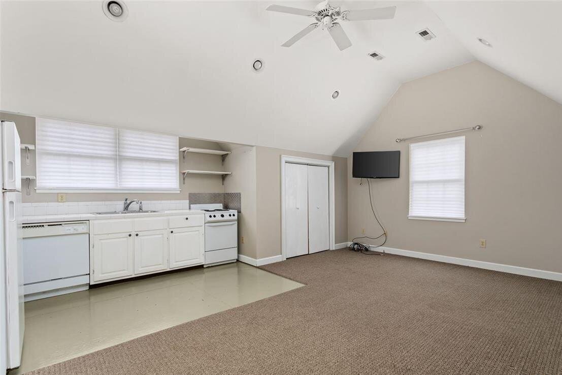
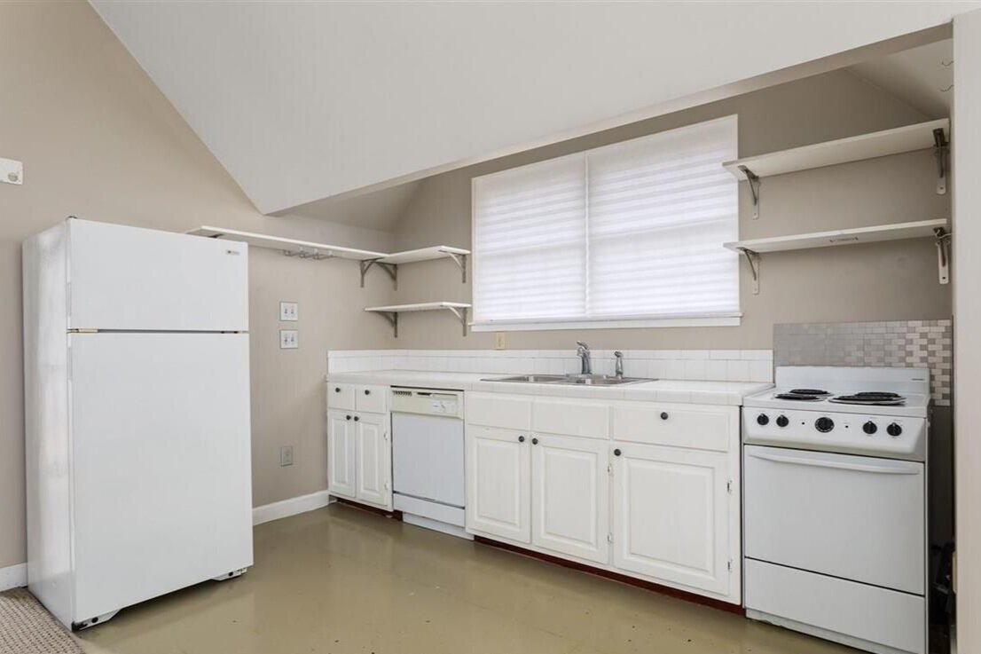
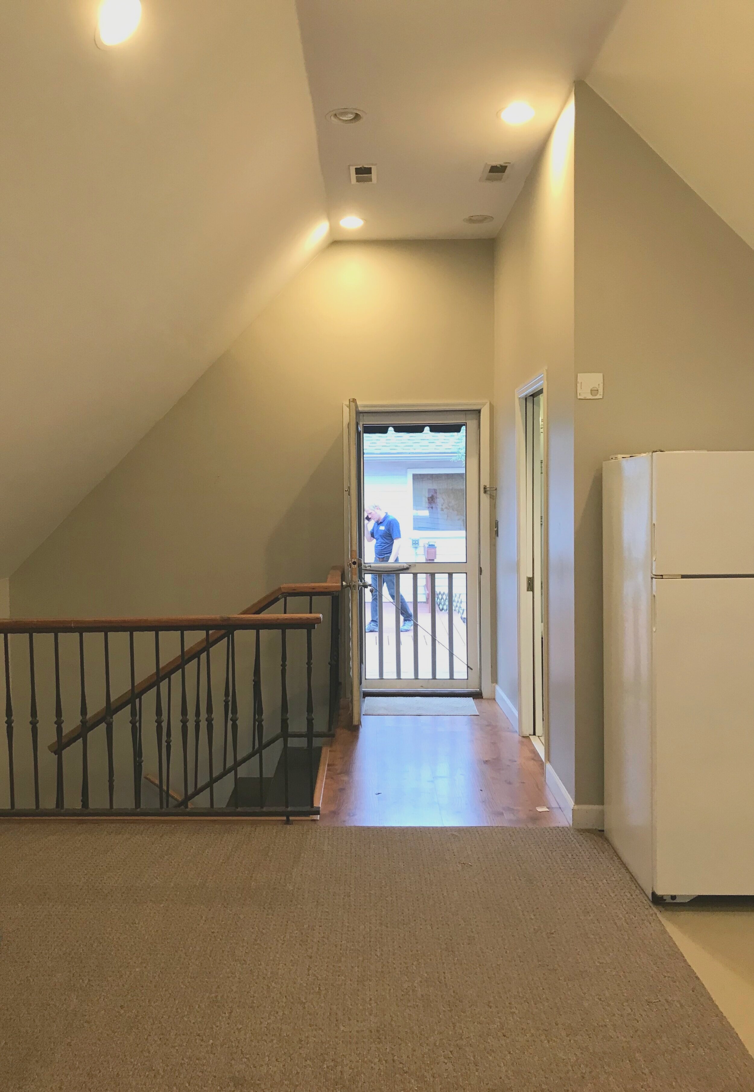
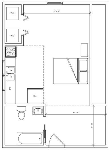
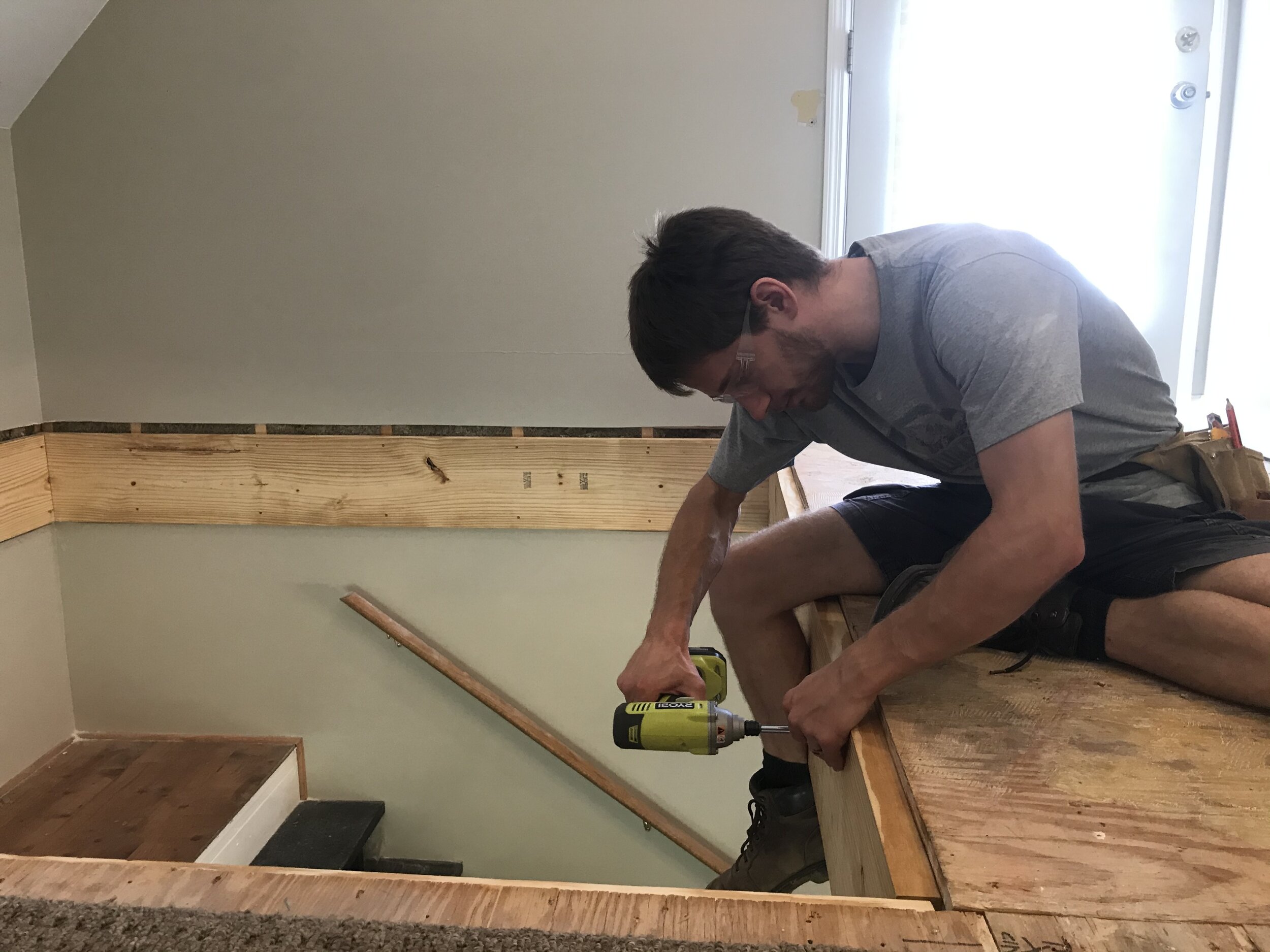
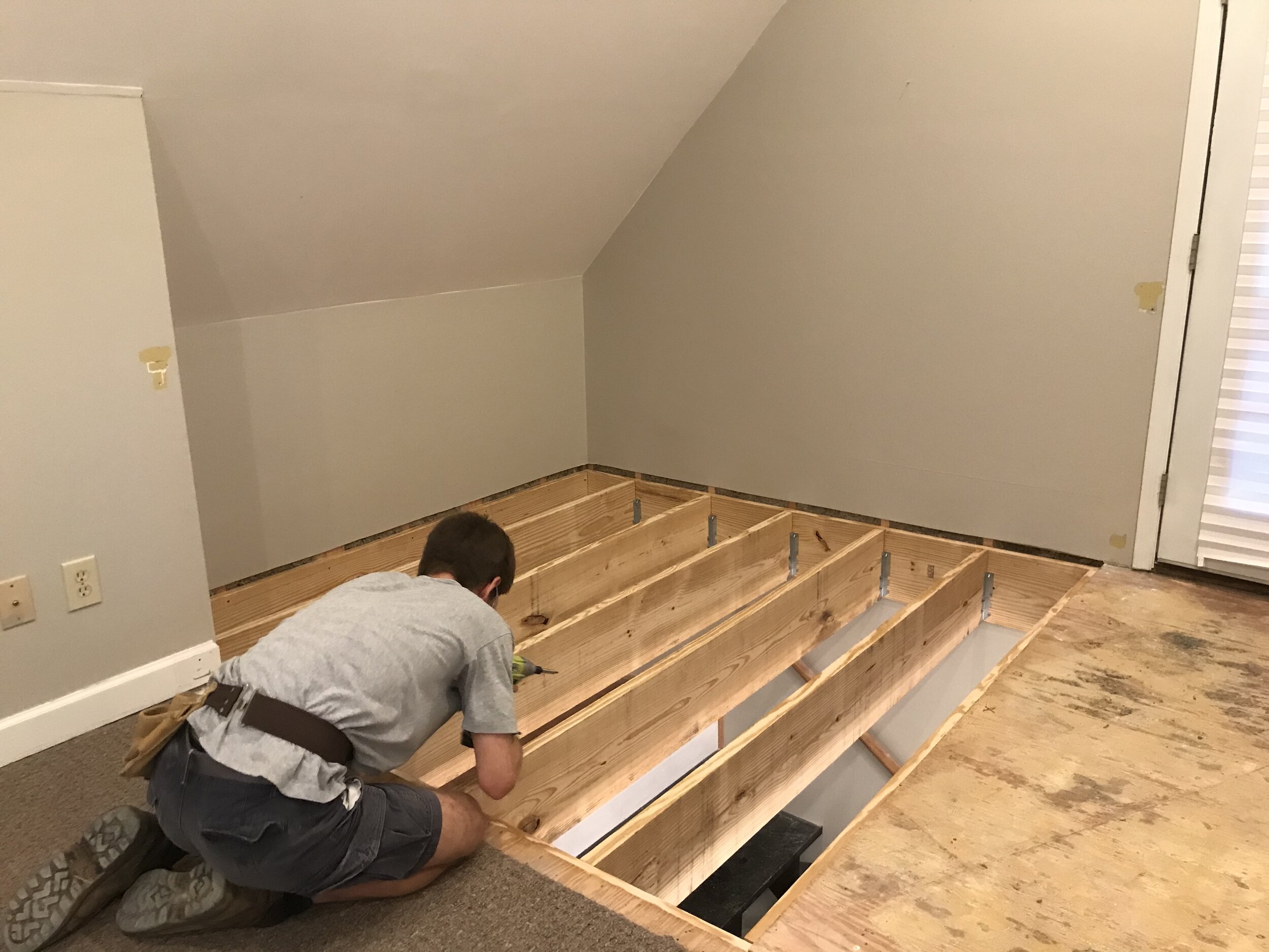
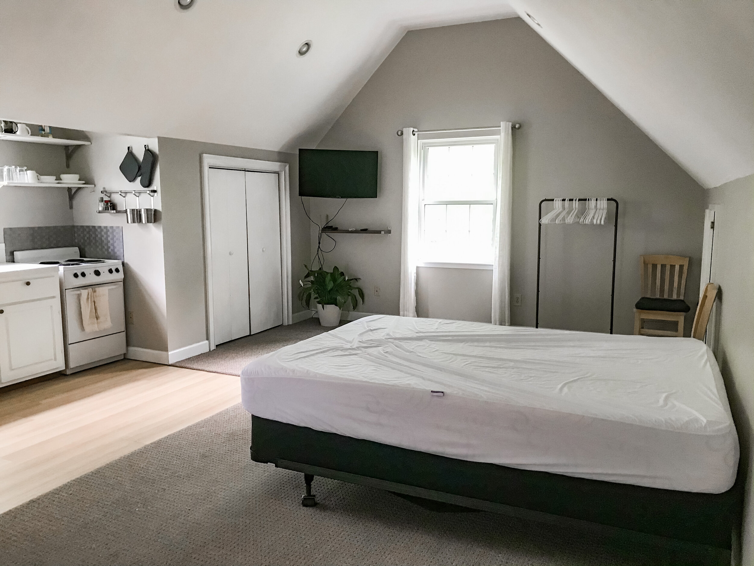
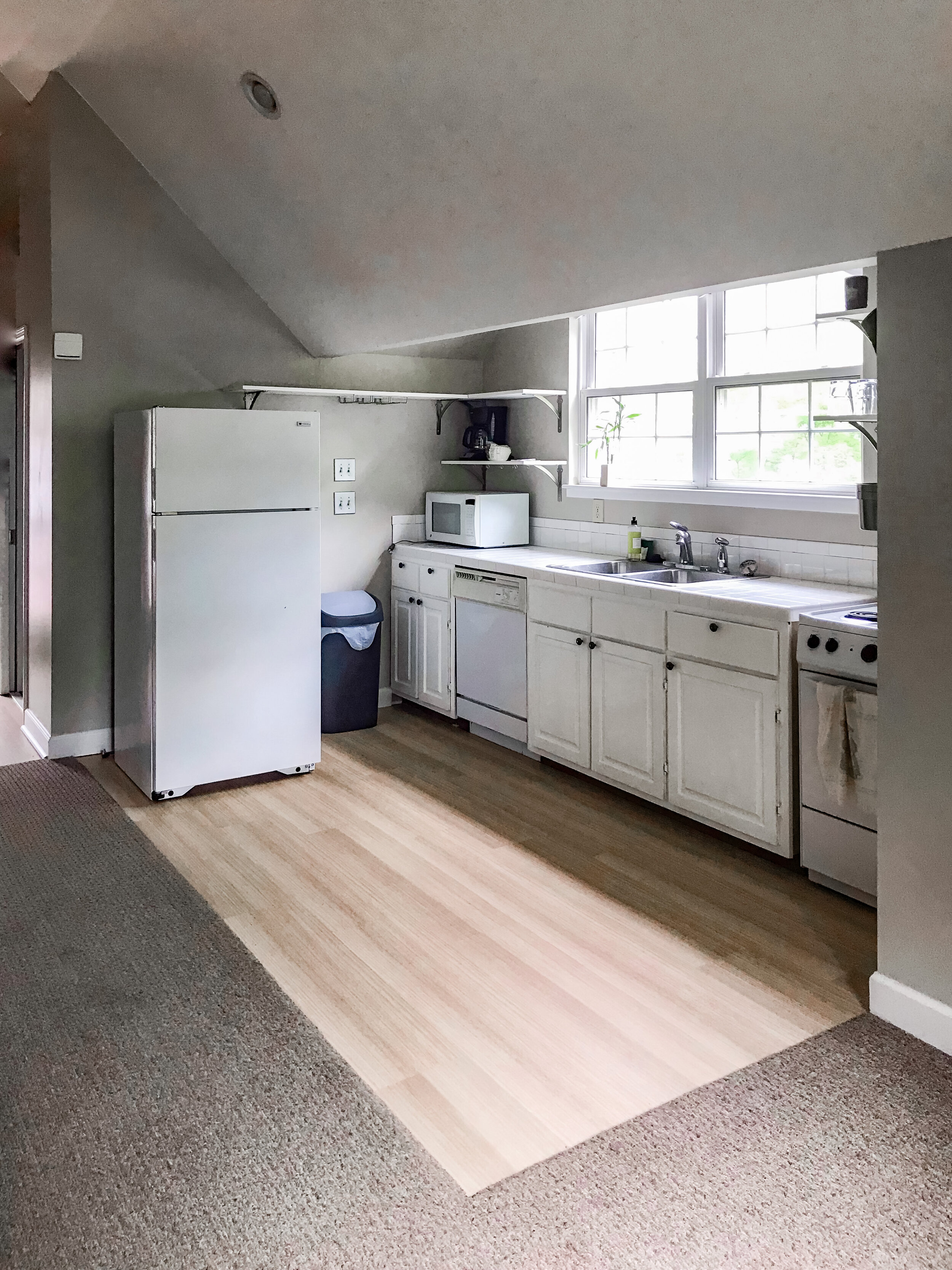
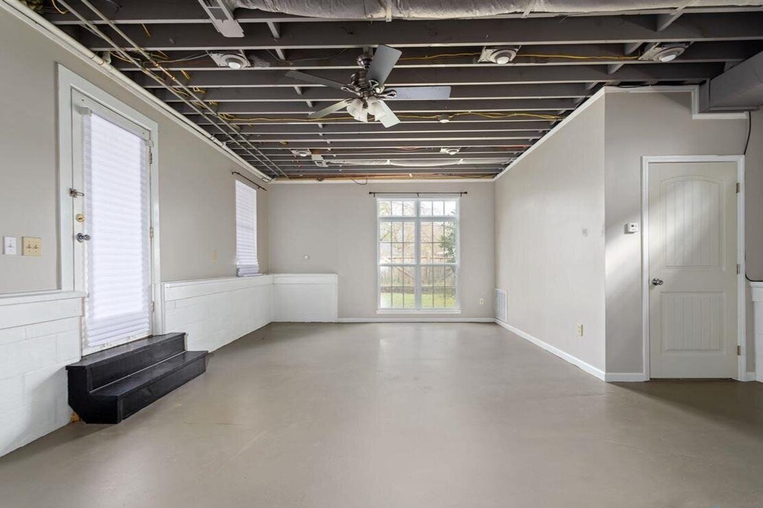
It also has promise as a rental unit. We’d like to offer it primarily to interns who are just here for a few months at a time; it’s just what Joey was looking for during his stints in Huntsville while I stayed in Atlanta. In order to make that happen, we needed to separate the workshop from the apartment. So we removed the stairs that connected the two. When I think of the projects we attempted this year, this is the one I’m most impressed with. Joey did all the planning, and I was his assistant. Those beams are heavy. We added new subfloor, and we laid new LVT there and in the kitchenette, which previously just had painted subfloor.
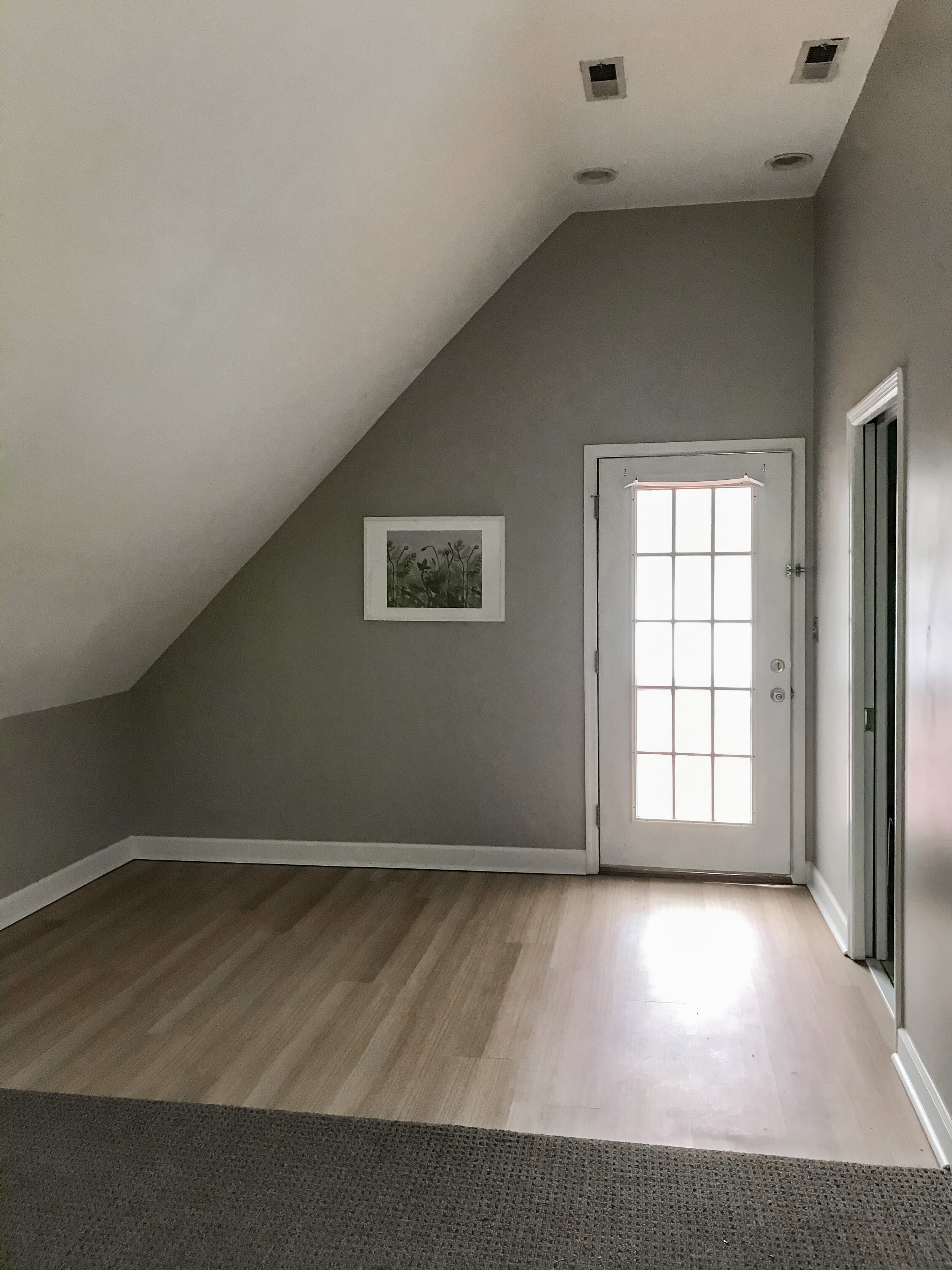
Other small updates: we added frosted-glass-look window cling to the door for privacy. Since I took these photos, we also found a dining table. I’m keeping my eye out for a used dresser, but in the meantime we bought a clothes rack that was inexpensive and looks surprisingly nice. We gave the unit its own wifi network and a Roku; it’s a very cozy little studio apartment.
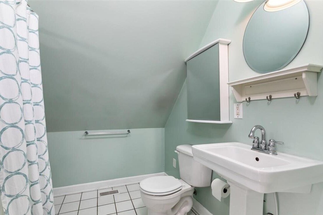
The bathroom is the real weak spot of the unit, but it will probably be some time before we get to any remodel there. Given what I’ve noticed of the building systems in this space, it’ll be a tricky project. For now, well… everything technically works.
A workshop was Joey’s only request in a house, and at first it was a limiting one. But here, he’s found his kingdom. It’s currently holding all manner of project supplies, tools, and debris. He loves it. We’ve also set up a small seed-starting station for me to work with this coming year. I’ve got grow lights and everything! More on that soon.
This post includes affiliate links. Click here to learn more.

